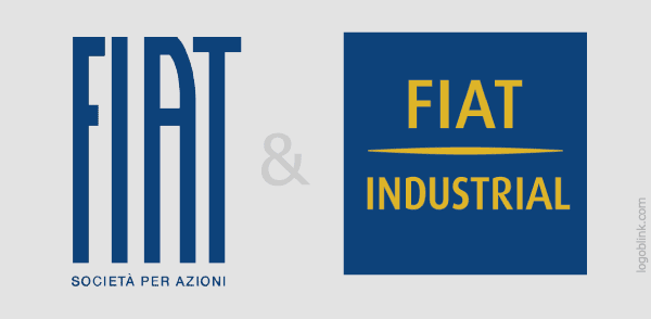
Fiat is dividing into two subdivisions and from 2011 these subdivisions will have 2 new logos.
Fiat statement : “The new logo has been created in response to the need to differentiate the automobile group from the product-related brand, reinforcing the parent company’s role in the management of a multibrand group,…”
The logos are designed by the company made the Fiat logo redesign in 2005.
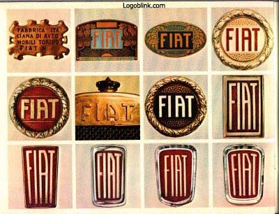
Old fiat badges.
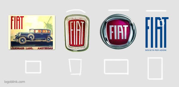
Above you can see some of the logos trough the years that were using this same typo in different variations. I like the first because the proportions are more squarish. The second one is charming and definitely gives the association of the “old europe car” which they’ve tried to reinvent in the 2005 “circle”. The new was is not bad, but it’s too minimal for an italian car designer and manufacturer. The problem comes from the lower part of the logotype where the straight parallel lines are too boring. As you can see in #2 they’ve fixed this by giving the lines a slight angle ( the letters are not 100 parallel ) and also they’ve put a curve on the top and on the bottom. Not a 3d illusion curve, but a light, very elegant one.
The new logo looks really like a auto logo in one way – it looks like the stencils on the driving lane, painted with white. This could be intentional or by accident. How knows…
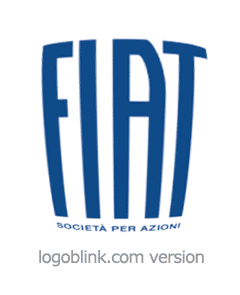
Just a fast preview what the logo could look like with some curves ….
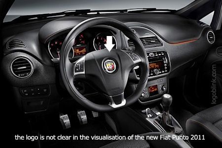
Actually they’ve used the Abarth logo. Check the comments bellow.

The logo has already been changed in Wikipedia wich is great for a brand-migration, but it hasn’t been changed in the official website. May be they’ll put some gradients and some trendy touches in the final online version of the logo. At this point you can see only this little red logo in the footer.
Btw – FIAT means “Fabbrica Italiana Automobili Torino”.
You can read a little more about the new logo in www.autonews.com
