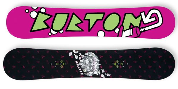
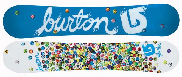
Let’s present you one of the largest snowboard brands in the world – Burton. It is founded by Jake Burton Carpenter in 1977 – he built the world’s first snowboard factory. His variety of products are marketed worldwide in over 4,340 stores with more than 1/3 being located in the US.
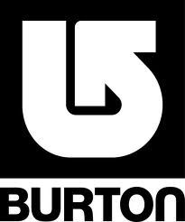
Burton created a clear, bold, iconic mark that would define the brand through the years. It represents a lower case “b”, a visual element related to the company’s name, and an upturned arrow. Because of the simplicity of the shape, the main aim is achieved. The Burton Snowboards logo design looks nice on each item it’s placed, no matter how small it is. When the arrow is scaled up to large size, it has even more impact.
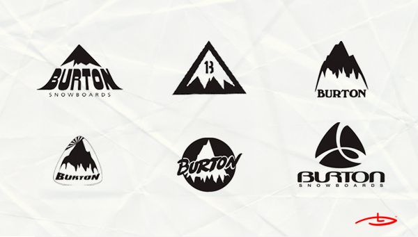
**What is more interesting about Burton’s logo is that since 1977 the design has been changing every year. **
Take a look:
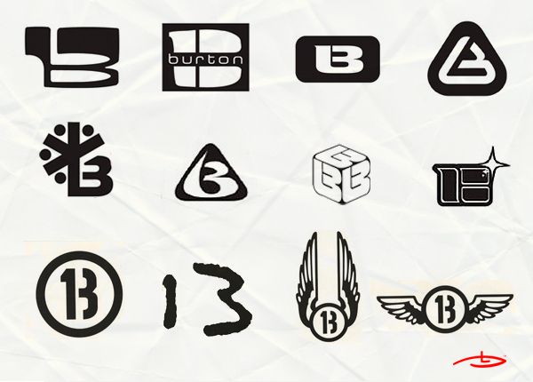
For years Burton had been using a stylized letter B in many different logos.
Also, a keen observer will see the number 13 hidden in the letter.
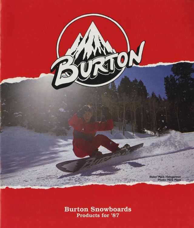
Catalog cover of Burton products from 1987/ Burton’s logo embroidered on a backpack.
Below you can see various logo designs inspired by the mountain’s peak, snow and slopes.

It’s funny the way how they always play with the shape of the sign and use it to show different ideas:
