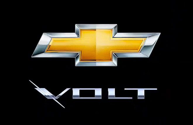
To be honest – I’ve paid attention to this logo just today. The campaign of the “Volt” is at its peak, so I clicked on one of the banners ( by the way – it was a nice banner ). Then I’ve clicked on the video to see a car that pretty much looked like some kind of Honda. After the videos was over I was… like “wait a minute – what was that crappy logo there at the end ?!”.
So this is a print-screen of the logo from the video. As far as I can see – the same logo is on the back of the car.
What bothers me is that it’s not readable. It’s a peace of trash. Is this the brand face of the most precious product in the chevi portfolio ? Well – it looks like not. A too skinny invisible line, that only a guy with a microscope would notice as a blitz ? So you have 2 cliches here – the “VOLT” name and the blitz electric symbol.
Yes, mini launched the best electric car logo already, but that’s not an excuse to neglect the brand brick of your visual communication.
If they haven’t spent a few minutes to fix the f*cking badge of the car – who’s gonna convince me that they’ve spent more time on the batteries or the other parts of the car ?
Cheap is cheap.