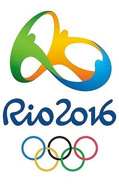
So this is the Rio 2016 Olympic logo. As every olympic logo – it’s in the center of attention for 90% of the graphic designers in the world… most oftenn accompanied by the words “I could design a better one” or “I can do this for 5 minutes”… etc. Yes, often a logo could be better designed or could be reproduced in 5 minutes. The thing is that a design is chosen for a reason and the faster you can memorize and reproduce it – the more successful it is probably going to be.
- PROS: It’s visible in variety of scales, it’s recognizable, it has classic color scheme, it will do the work
- CONS: It mixes 2D with 3D ( gradient mark with non-gradient logotype and olympic symbol ), although it’s recognizable it still reminds of many other logos.

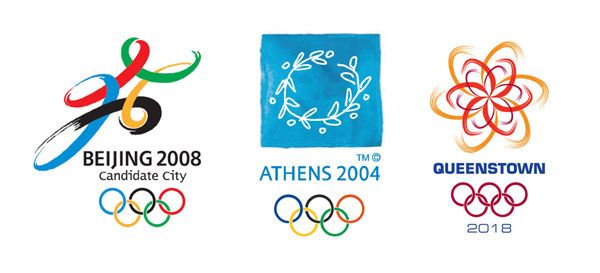
This is a mini logo set of 3 other olympic logos, treating the problem in a similar way. The first one is a proposal that was used when China was a candidate for the Olympics. Later they changed the logo to the red, more “traditional” guy. You may ask yourself the question why they changed this not so bad working logo… The answer for myself is that it’s not distinctive enough. Also because of the national propaganda :) The second one is the official Athens 2004 logo. A great one, although, personally I don’t like too illustrative logos. The Olympic wreath is updated and there are stylized people incorporated in the design. Pure classic. Well the background is a different story, but hey – they needed something non-designish. The third one is a Quenstown, New Zealand 2018 Winter Olympic Games bid. It’s also using the idea of the circle/elipse as a base.
Going back to the Rio 2016… and the really exploited topic about “people holding hands” ,”dancing people” , “people in a circle”…

- www.2010taipeiexpo.tw – Taipei International Flora Exposition ( I actually like it )
- www.thehumanchain.com – Management Consultancy Company ( more yes than no )
- www.logodesignblog.co.uk/logo-design/logo-design-for-forum/
- www.mentalhealthfirstaid.csip.org.uk/~virtualward/environment/policies-and-practice.html (could be redesigned and boosted with minimal effort)
- www.commonwealthgame2010.com/delhi/logo.html ( it’s a working logo )
- www.people2people.biz (a company in India and UK, but I think the logo is made in India)
- www.whitedesign.co.uk ( it’s interesting )
- www.jfsla.org ( I prefer the web design )
- www.capregboces.org / Board of Cooperative Educational Services
- www.maap.org
- www.jhsph.edu/gatesinstitute/policy_practice/conferences-meetings/adolhealth/index.html
- www.webolution.co.nz/go/what-we-do/design-and-illustration/logo-and-identity-design (they have real logos, too)
- www.austinpcc.org
- apfvietnam2010.org.vn/modules.php?name=News&op=detailsnews&mid=89&mcid=21 (way overcrowded)
- www.cwd.org
- www.shakealegmiami.org
- en.expo2010.cn
- www.namasteracommunity.com
- www.melon.bz/communications/branding-identity/hr-community-of-the-province-of-nova-scotia
- home.vncnus.net/what-and-why-vncnus
- www.adec.org.au
- www.copsa.fi/international/index.php?option=com_content&view=article&id=66&Itemid=63
- macelm1204.blogspot.com/2009/01/innerwheel-club-of-midtown-santiago.html
- www.laosfairtrade.net/2010/05/world-fair-trade-day-celebration-vientiane/ (I like it)
- www.amyong.com/folio.htm (rotated under some strange degree, right ?)
- www.unitedsouthwest.org (good idea, bad design)
- www.choicescare.com/p/new-staff-suggestion-scheme-I1059/
- www.boefoundation.org/grantees/the-family-learning-center
- blog-omotives.blogspot.com/2007/02/toot-toot-jeff-fisher-logomotives_24.html
- www.umaine.edu/link/HearMilestones.htm
- www.cev.be/9-cev_member_organisations_belgium_3-en.html (maybe 3 people with a common head?)
- www.ubuntu.com/ (one of the best community logos out there that sets the trend for many stock logos years ago)
- www.knowcancer.com/events/
- www.focol.org/toward/about.html
- groups.yahoo.com/group/UNA-SA/message/205 (good idea, the design could be better)
- www.whoamipoems.com – a weird logo experiment, but you can see a lot of these on the net
- www.curtaincallproductions.co.uk/chairman.html (not in a circle, but still an interesting logo)
- www.riofortourists.com/the-truth-behind-rio-2016-olympics-logo/ (you’ll see this in some blogs, compared to Rio 2016, but it’s too far away, I like the Rio design more)
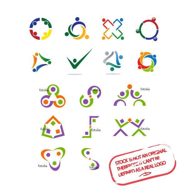
Just a reference what’s out there in the stock market, so you can compare styles and quality. Please do NOT buy stock logos. They are not real logos and will never be. If you do so – consider that thousands of other people are gonna use “your” logo as theirs.


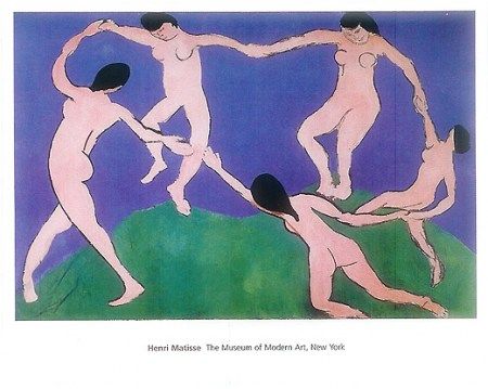
You gonna see this Matisse picture as a reference to those type of logos, but the truth is it’s just an overrated painting hanging in a museum. Nothing more. People had danced, are dancing and will dance many more millenia… and we’ll keep creating more and more “dancing in a circle” logos :)
Check some more visualizations of the Rio 2016 here.


