Today I’m gonna talk about one brand that is always present in ours lives… or better… in ours wallet. It’s the famous blue, white and gold logo that has earned a permanent place in the minds of the consumers around the globe… The VISA Brand.
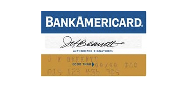
The Visa International Service Association, how we know today as VISA, born in 1958 when the Bank of America launched the pioneering BankAmericard credit card program only for in-house product development think tank.

Nowadays the VISA card it’s a joint venture of 21.000 financial institutions that provide services of Credit Cards and Debit Cards. Connects consumers, companies, financial institutions and governments in more than 200 countries worldwide, it allows using the digital coin instead of money and checks. The company facilitates the process of transitions on the name of the financial institution and tradespeople by the VisaNet, one of the most advance global networks, capable to deal with more 10.000 transactions per second.
The appearance of this brand never change much in the past 30 years. The first appearance of the VISA logo in the card was in 1970, with the word VISA typed in the middle of two lines, almost the same aspect of the BankAmericard. Then, appears a little change in some cards, where the trademark flag disappear and giving place to a kind of underlined on the word VISA but, maintained the principal colours of the brand, gold and blue, that represent the blue sky and golden-coloured hills of California, where the legacy Bank of America was founded. The Typography suffered some changes during this time. At the beginning, the writing it was used was almost in italic type, with huge accentuation of the inclination on the “V“. With the passage of time, the typography was changing, not completely but, the inclination was passing by and the Kern type was adjusted. Now, with the new logotype, VISA suffers a big change. The typography, is almost straight, the trademark flag and the kind of underlined disappear, and give place to a new a golden flick on the “V”, that give a “crisp, clear and concise” image to the new brand.

“Visa USA launched today a new look for the famous blue, white, and gold Visa logo for the first time in 30 years. The new brand is designed to better reflect the broad range of electronic payment products provided by Visa’s Member financial institutions and the ever expanding environments in which they’re accepted.” » VISA, Inc. – Press Releases, SAN FRANCISCO, January 3, 2006

The company wanted to combine and differentiate the different kinds payment products including debit, commercial, and small business credit cards offered by Visa International as well as its members – the financial institutions. This new brand has to be a reflection of the expanding environments in which Visa cards are accepted, using several application of the visual image of the brand.


