In this article I’ll write about one interesting and well done logotype …. and try to explain why this can be a good logo design.
Karrimor is a brand of outdoor sports equipment and clothing. It was founded in 1946 by Charles and Mary Parsons, and nowadays the Karrimor equipment is “selected by some of the world’s most accomplished mountaineers, combining optimum durability and cutting edge technology to provide the ultimate tool to succeed.” » Karrimor.com

When we look at Karrimor logo the first thing that comes to our mind is the flag of the United Kingdom … and we are not wrong.
This similarity can be intentional, since the marketed product is manufactured in the UK, so there is nothing better than exposing this quality in the corporate image of the brand; This way it will be an asset to the success of the brand, be recognized as a product “Made in the UK”, and the power it has within consumers (see article “The Power of Brand” related to branding techniques).
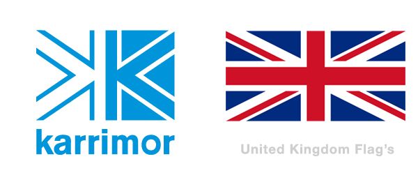
Analyzing the logo, we can find something allusive to the flag of the United Kingdom, played through two “K”, one normal and the other in mirror. According to Gestalt theory, don’t have aware of the “whole” just for their parts, because the “whole” is more, is the sum of these parts, so “A + B is not simply A + B, but a third element C, which has its own characteristics.” In this case, we analyze the structure of the Karrimor logo by the letter “K“, playing with the negative and the positive, presents us with a third image. While not a perfect representation of the St. George’s Cross but, the image of the flag of the United Kingdom is very clear in our minds when we first see the brand.
Like any brand, we have to see where this will be applied and in what situations and modes will be reproduced. In this specific case, the brand Karrimor relates to products of high quality clothing and equipment for climbing and adventure sports, so the reproduction of the mark in these products have to appeal to various techniques of reproduction, not a mere impression, and many of the cases greatly reduced in size … For this reason the printing must be well selected and Karrimor was not random. The selection of a Sans-Serif type has a lot to do with the applications of the logo, since it is a very readable font in small-format printing and very pleasing and clean at a large scale. This kind of type is also suitable for reproduction on labels, packaging, textile … Furthermore, this linear typography, brings some sobriety to the brand, which is strongly marked by its straight lines, establishing a very geometric to the visual image presented on the area of a square well-defined, or sometimes as a linear rectangle .
Below you see 2 examples to demonstrate the difference between the logo with a Sans-Serif Type (right) and another witha Serif Type (left).
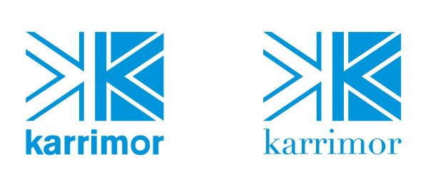
In most cases, the logo applied on a very reduced scale may lose readability and the brand becomes imperceptible. Karrimor solves this imbroglio, not only with the selection of a Sans-Serif Type but, also with the dematerialization of the square format.
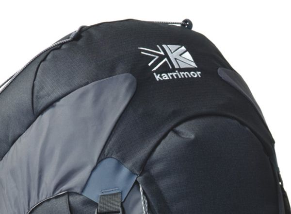
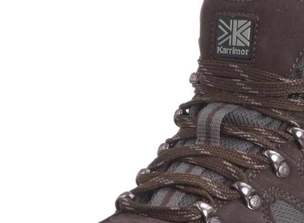
An interesting example of the karrimor with capital “K”

The mark above the signature, moving to a more horizontal format, where the signature accompanies the image on the same horizontal axis, forming a linear rectangle. Thus, the brand identity remains noticeable, without losing legibility and maintaining its identity.
**Note that the Karrimor brand has a history dating from 1946. **
Here are some old logos we’ve found:
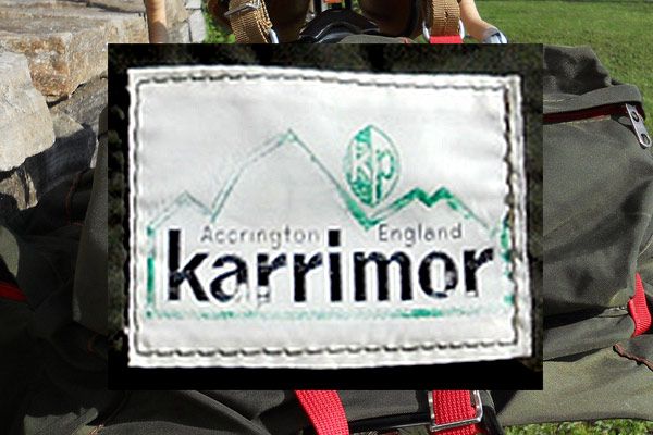
This is the previous logo I’ve found, using similar logotype. Source: flickr / mich08ael
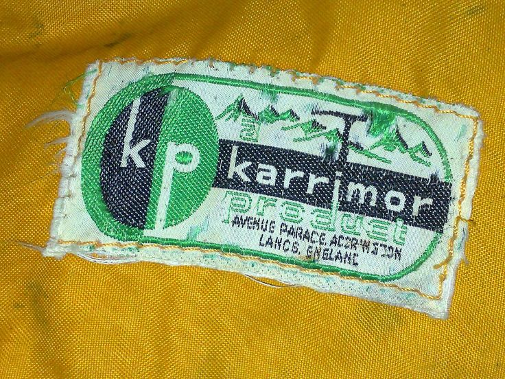
The logo above is from around 1980. Source: wapster
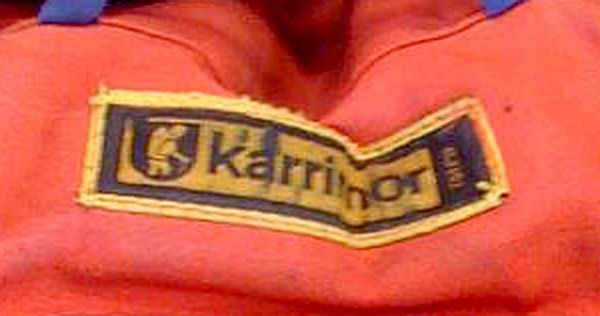
Totally different logo. Probably 40 years old, if we consider the previous versions. Source: Jonesnow
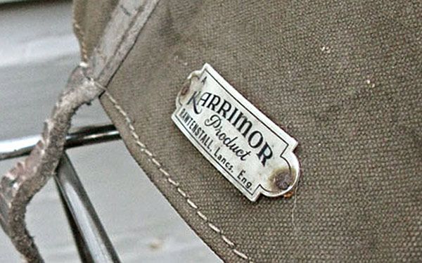
This logo is not dated, but looks at least 50 years old. Source: assemblylinecollective


