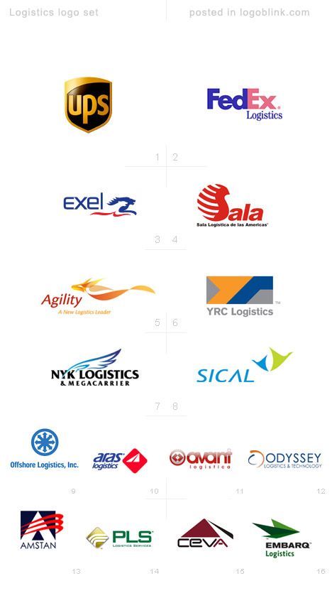
The UPS logo is one of the most recognizable logos in the world. Maybe it is not the best according to most of you, but somehow I like it most (maybe because I really like Paul Rand’s works). I put the UPS logo first in my set because of the idea of safety represented by the shield. When you send something to somewhere you care about how fast it will get there, but more important is that it actually gets there.
FedEx logo is also one of the most recognizable logos in the world. It’s clean and clever. One one of my favorite with the negative form of an arrow between ‘E’ and ‘x’, signifying the company’s services.
I have to admit that I haven’t seen the other designs in the logo set before. What is common between all of them is that all these examples express in some way movement from one direction to another. This representations is achieved by arrows, diagonal lines, wings and/or birds, stylized running animals (lions, rabbits etc.) serving as symbols.
As you can see – the colors are quite different. Obviously, bright and dark could do equal work in this case. The majority of the logos in the two sets, presented here, are betting for some reason on the combination of 2 colors. Maybe the usage of too many colors will spoil the “serious” look or the design decision is directed by the print expenses? What’s your opinion on this topic?

I think “YAMATO Logistics” deserve admiration for their “brave” design concept. The black & yellow logo is very original and memorable.