You probably know the best online software for presentations out there – PREZI.
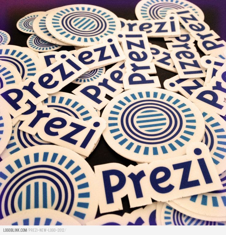
Recently they have changed their brand identity.
It’s now more “blueish” and more cold-corporate.
The logotype is more conventional.
Personally I like the funny two-way-“r”.
The “e” is the already popular “smiled-haineken E”
In case you wonder where the mark comes from and why it’s so detailed for a logo – it’s actually a tool from the software itself.

I like the visual illusion for motion that the “sun” creates, but I bet it will be simplified at some point after a few years with only one or two rings in the middle and less “rays” in the outside stroke.

The logo in stickers.
The social environment is a test for every logo. Check the new prezi logo as an avatar. Vimeo thumb ( 3-rd picture ) looks cool the way it’s cropped. They’ll probably start using it more and more in other cases.

The logo in Facebook

The logo in twitter

The logo in Vimeo
Here’s the old design, case you were wondering how the old logos looked like:

