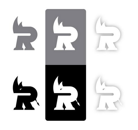
You should check this post in order to understand the approach and the act of creating logos. The following logo case is done by Von Glitschka. Enjoy!
“Logo design is fun for me. I guess the main reason is because it’s a good mix of design, illustration and investigation. I have to look into a graphic problem and discover a working solution for it.
That challenge intrigues me and I enjoy the process of discovering that one clever idea that makes a winning design.
The following steps will take you through a recent logo re-design.
Vector Safari / Total Time: Approx. 9 hrs
01_Old_Mark:
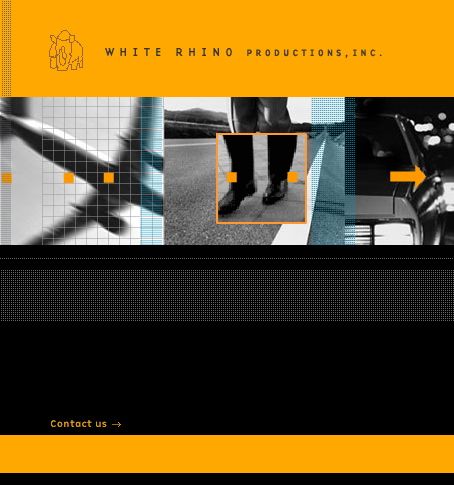
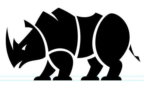
White Rhino Productions is an ad agency out of Ohio. They wanted a new logo to brand themselves with. They asked me to develop a new mark for them that would reflect their name better.
They originally asked for a logo that showed a Rhino facing straight forward. I resisted this specific direction and convinced them I could accomplish what they wanted without reverting to the same format as their previous mark.
02_Reference:
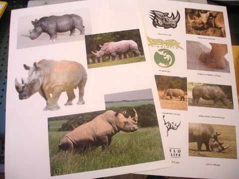
I’ve said this before in previous tutorials but it’s always good to refresh our memory. You may in general know what a Rhino looks like but if you were going to illustrate one realistically or graphically you’ll pull it off with more precision if you study what a Rhino really looks like.
Referencing minute attributes about a Rhino, studying the way their body shape is structured, how their eyes are lower on the head etc. will help you in drawing your own artwork. Picking up on those subtle visual cues that will make your final work more authentic and effective.
03_Thumbnails:
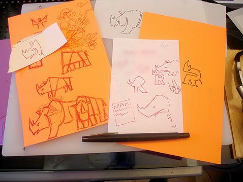
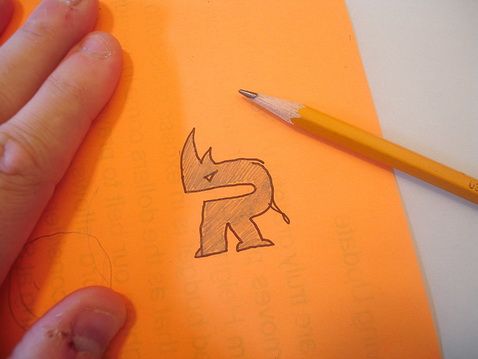
As you can see I thumbnail on whatever I have at the time I am inspired. At this stage I am just trying to establish a few directions I can then flesh out more and develop upon.
04_Drawing1:
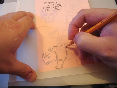
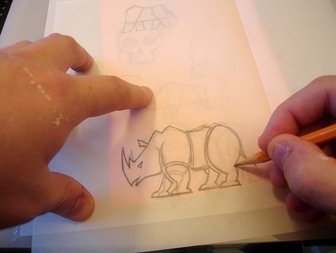
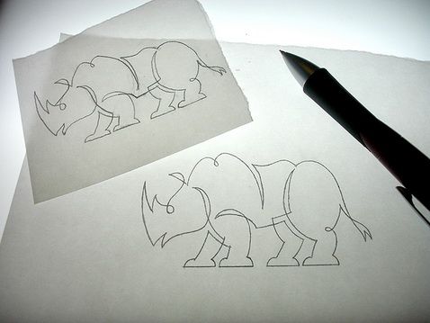
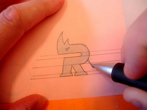
Working off my thumbnail sketch I place vellum over the top of it and start to work out my drawing more thoroughly. I pay close attention to the shapes and how they relate referring back to my reference images so they stay true to life as well.
05_Drawing2:
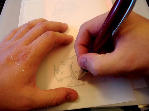
Placing a new piece of vellum on-top of my initial drawing I re-work it and improve the shapes and how they relate to one another. I’ll do this multiple times on any given project. Some may think this is anal but it’s all part of paying attention to details and creating the strongest art you can.
06_Refining1, 07_Refining2:
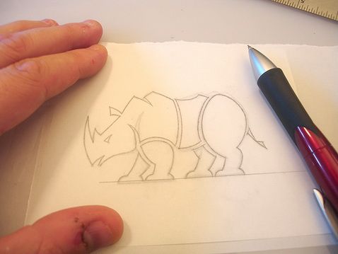
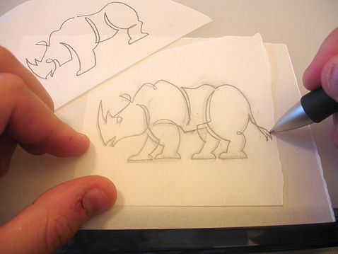
When I work out my art I tend to draw, re-draw and re-draw again until I have refined the art to be the way I want and looks exactly how I want the final to look. In other words I leave very little guess work as I move into the digital realm to build it. I already know what it’ll end up looking like at this stage.
It’s my opinion that too many designers and illustrators don’t spend enough time just drawing and refining their work. Thus their final work isn’t as polished, refined and ultimately as effective or appealing as it could be.
That said you should always be looking for improvements at each stage of a project and some of those will happen in the digital aspects of it that you cannot realize at this stage but the more you can weed out problematic areas now the less you’ll have to catch later on in the creative process.
08_Alternate_Direction1, 09_Alternate_Direction2:
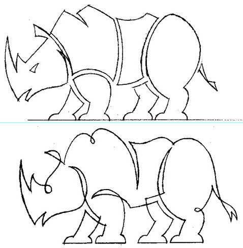
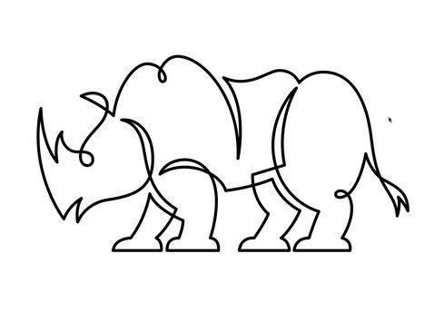
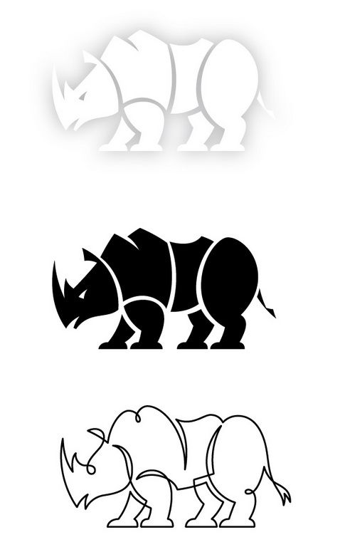
There were two directions I wanted to present for this project. These two images show the linear line option I wanted to present. This style utilizes one continuous line to create the artwork.
I drew off my thumbnail sketch, refining it until i had the exact artwork I needed to then scan in with my other refined sketch.
10_Scanned_Tiff:
I scan in my two refined design options and save out as a bitmap tiff to place into my drawing application.
11_Building_Vectors, 12_All_Paths_Done, 13_B&W_Filled:
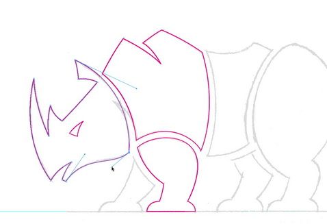
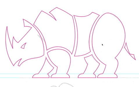
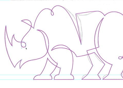
Since I’ve done all the heavy lifting creatively in my sketch stage all I am doing with the computer now is merely building my vector shapes. This isn’t creative work per say it’s more production oriented. So if you make sure to refine your art prior to this stage then it’s a no-brainer task because all your decisions have been made already as to how to creatively pull it off.
If you look closely however at my scanned in image I did make an on the fly tweak to my artwork. I decided to make the head completely detached from the torso shape. This is an example of making art direction decisions as you go along. It’s not a spurious change either it’s one that improves the overall art so it’s important to be looking for these small but powerful changes throughout your creative process.
I fill in the final vector shapes. Obviously it can’t be black with the name ‘White Rhino’ though so I still have some creative work to do in terms of capitalizing on a concept I have in mind.
14_Building_Second_Option, 15_Finished_Linear, 16_Thickness_Set:
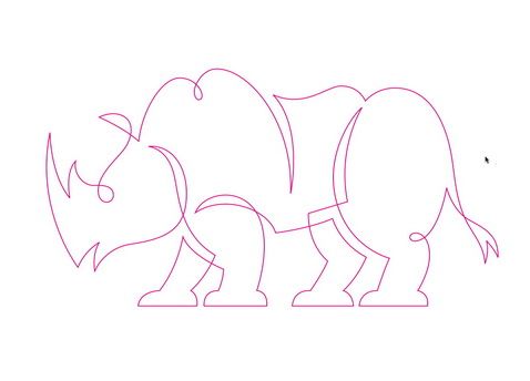
When creating linear art it’s about the easiest form of illustrative design there is to build. Once you have a vector stroke created and all the various cures finessed it’s done. This also shows why it’s so important to draw out your ideas before building.
The key to creating this vector art with precision is to place your points at key locations on the path. If the art has a sharp point in it then the point should go at the apex of that shape etc.
Once I have my final linear path created I just coloring the stroke black and set the thickness. The thickness would of course change based on size and usage. I decided to create this option because it allowed for the white background to play up the ‘White Rhino’ aspect of the name.
17_Presented_To_Client:
When presenting my art to the client I took my original concept and playing off the name of ‘White Rhino’ I executed it as shown at the top of the image. If printed in full color it would be done this way on a white background. I also presented to them that on branded identity they could pull this logo off as a blind emboss and not print anything at all.
The client loved the concepts and picked the top version shown. Unlike most jobs there were no changes and I delivered the final artwork.
18_Another_Idea1, 19_Another_Idea2:
If you go back and look at ’03_Thumbnails’ you’ll notice an idea I didn’t flesh out. Well after the client approved the art after the first presentation I decided to go ahead and throw a few more secondary marks at them and see if they’d like those too.
The only reason I didn’t originally pitch them is because they didn’t really fit the assignment given me. Having the art approved now I decided to go ahead and create this secondary mark for no other reason then I thought it was a good idea and I didn’t want it to forever be lost in an old project folder. LOL
20_Building_Secondary_Mark:
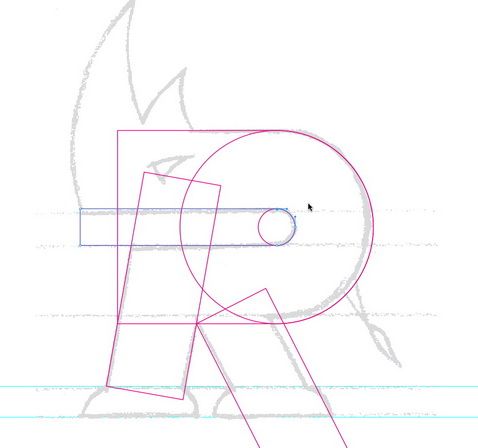
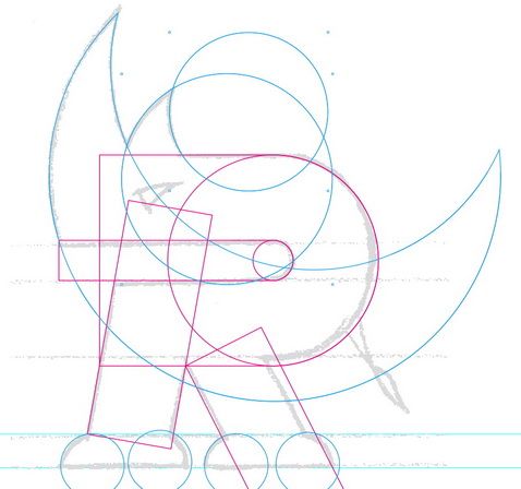
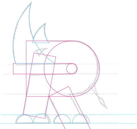
Even though this mark is based on a letter form I hardly ever use an existing typeface to begin with. I’d rather have complete control and frankly it just goes faster. 90% of this art will end up being created using basic shapes like circles and rectangles anyway. It’ll also give me more control than trying to adapt my art to another designers letter form.
21_Drawing_With_Circles, 22_Circle_Shapes_Punched:
I could of created this secondary mark by simply clicking down points and drawing the paths but in this case it would look far better and be more precise if I simply used circle shapes and just punch them out of other circle shapes to create the end shape needed. This is easily done with the ‘PathFinder’ palette within your drawing program.
To see a more in-depth tutorial on shape building visit www.IllustrationClass.com.
23_Finished_Paths, 24_Filled_B&W:
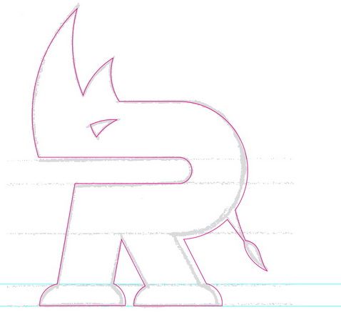
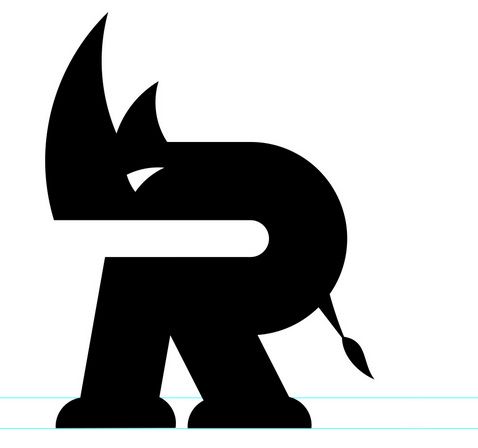
Once I have the final shapes all fused together and complete I fill it with black. At this stage with any project I tend to print the art out at various sizes to see how well negative spaces hold up etc.
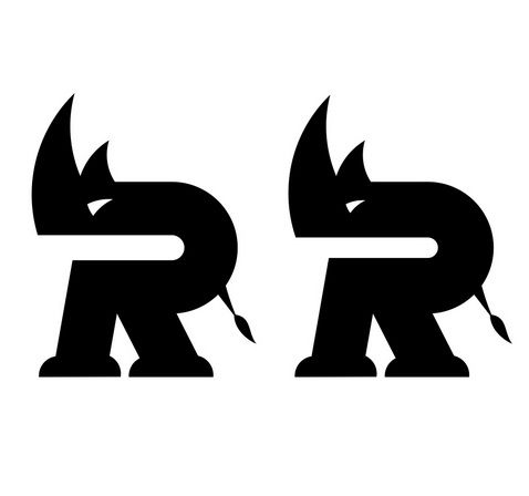
When I did that with this art I could see the inner white space of the ‘Rhino R’ was a bit too thin and needed to be adjusted.
25_Tweaked_Detail:
This shows the before and after negative space of the ‘Rhino R’. Once again it’s important to find these areas you can improve upon as you go about your project. Don’t avoid them, be your worst critique and it’ll make for less changes on the client side. Don’t give your client the opportunity to art direct, do it yourself. I like to say “Clients may be the king but they aren’t the art director.”
26_Secondary_Mark_Final:
Once I finished this mark I sent off another comp to the client. They really like this approach as well and thought it would work well as a support graphic for their overall re-branding.
I had fun with this job, it all went pretty smoothly too and that has more to do with my systematic creative process then it does anything else. It’s important for you to refine your own creative methodology, know how you work best, don’t settle for marginal, experiment and try new things and pursue artistic excellence.
”
Visit www.glitschka.com for more inspiration!
