Our new visual identity is just the beginning of exciting new things from our team, and we sure hope you like it! If you want to read more about our process and insights, Iâve shared some highlights after the jump.
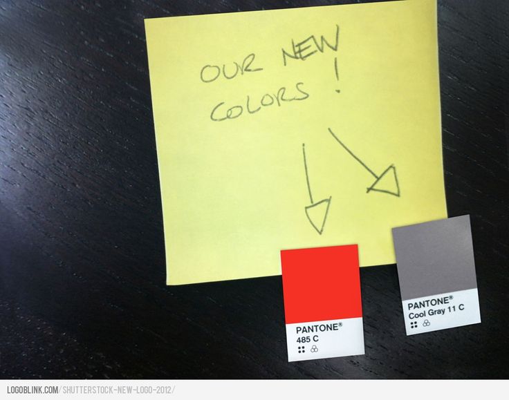
Still reading? Great! The team is thrilled with the new visual identity system we developed with help from our very talented friends at Lippincott, and we hope you are too! We think thereâs a lot to like here â from the âOâ as a âViewfinderâ that lets us put our contributorsâ content up front; to our bold, two-color design. We fell in love with the modern typeface, the bold color, and our ability to activate the identity in an endless number of ways. This identity reboot is about the ideas, just as much as the visual aesthetic.
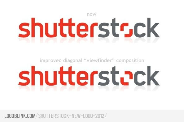
May be you’ve noticed the diagonal of the “viewfinder”… and may be you want to see it the proper way :) Here’s my preview :

Which one do you like more ?
Read the full text here .

