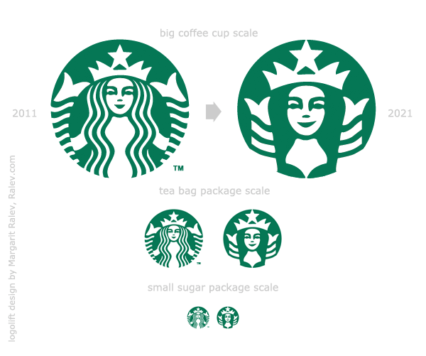
As you know Starbucks redesigned their logo for their 40th anniversary (2011). Twitter was flooded with the news last week. Bullet points in the story are:
- Why? They need to sell more stuff than just coffee these days
- Who? The design (the crop) was home-made ( in-house design by Starcbucks)
- Who else? Lippincott and BBDO will help for the brand rollout in the next few months.
- Reaction: designers are OK with it, consumers are not so OK, but they’ll get used to it after a month or so.
It’s only logical that for the 50th anniversary they’ll create another logo-lift *.
I’ve asked myself what it would be…
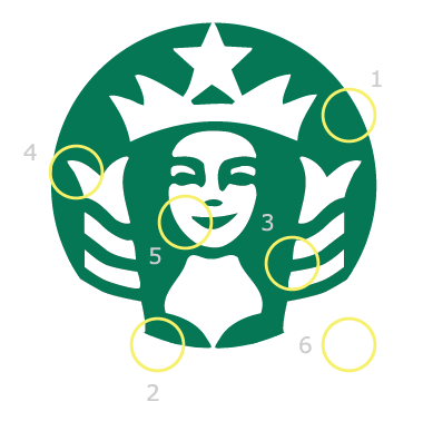
- She’ll be bigger (1). Not because of all the sweet things they sell in Starbucks, but because they’ll sell more products in any scale and they’ll need a mark with less details, visible in smaller size.
- She’ll no longer be a mermaid (1a) – instead she can be referred as “the Green Lady”. As we know – mermaids are kind of nasty and don’t have such a good PR as the fairies, for example.
- She’ll be wearing a bra (2). No, Starbucks will not sell bras! ( Actually I’m not 100% positive about that…) Since the original mermaid was naked – they’ve tried to remove the nipples, but left the same breast shape… so in 2011 she’s still naked but with bad Photoshop retouch. Meanwhile the feminist movement will grow even bigger and they’ll read this post some day and they’ll propose to “dress” the poor woman. Besides – a bra would bring an even sexier image to the Green Lady.
- She’ll be without hair (3). Just kidding. The hair will be there, but again – because of the detail removing – her hair will be removed and marked as a silhouette between the fins as a negative image.
- She’ll have fin-arms (4). Cropping will leave hands out of the picture (literrally) so the fins could be rotated a little bit. This way they’ll not only mark the hair, but they’ll provide the association of hands, holding… cups of coffee ?!
- She’ll smile more (5). Just a little. It’s an American brand after all. Besides – there should be something positive in the press release – she’ll look happier.
- She’ll no more **be **a trade mark (6). She was a registered mark until 2011, now she’s a trademark and in 2021 she’ll be something more – an international symbol of the people drinking coffee (and other stuff), protected by the community…
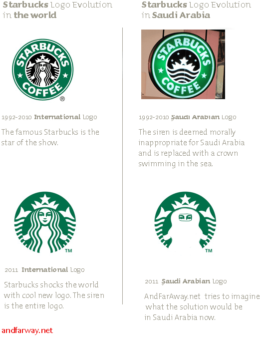
Here are 2 more scenarios for updating the logo by andfaraway.net and Felipe Torres:


- Logo-lift – like a facelift, but for logos – a brand term, invented by Logoblink.com
