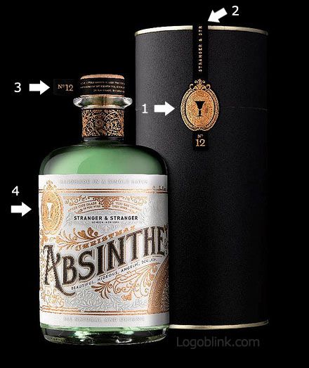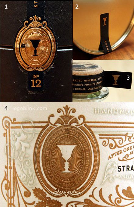
I was first impressed with the package… then I’ve noticed that they’ve used the logo on a few different places without overdoing the identity. The logo itself is nice in both of the variations – the positive and the negative glass, formed by the two faces, the two strangers. It’s a famous optical illusion, used in many places with different proportions.
I hope this nice package design will inspire you for your works.

source: http://www.quintohache.com/blog/absenta-espiritu-verde/