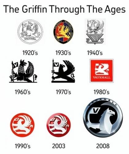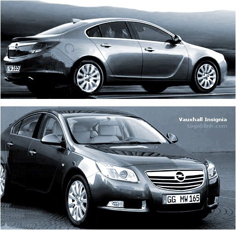

In order to understand better the new 2008 Vauxhall logo you should check the design of the latest generation cars by the company. Such one is the design of the Insignia model bellow:

In my opinion the previous version of the logo (the red one from 2003 ) is better designed, but obviously the British Opel needed a new logo which should correspond more accurately to the policy of the company. The “American” look needs an American logo… Black and Silver is the answer. The very aggressive shapes and the bigger head of the griffin are also a part of this answer. Here’s what we read in Autounleashed.com:
“Today ( 09. 04 . 2008 ) , Vauxhall presented their new logo, which will debut on the upcoming Insignia. With this new logo, the British GM subsidiary wants it to inspire “modern, fresh and inspired”, just like their current cars, the redesigned Astra and Corsa, plus the upcoming Insignia.
Bill Parfitt, Vauxhall’s Managing Director, said “While the new-look Griffin pays homage to our 100 year-plus manufacturing heritage in the UK, it also encapsulates Vauxhall’s fresh design philosophy, first showcased in the current Astra, and set to continue with Insignia”.
As we said, the new Vauxhall logo will debut together with the new Insignia, at the British International Motor Show in July. After the show, all Vauxhalls cars will roll out of the factory wearing the logo.”
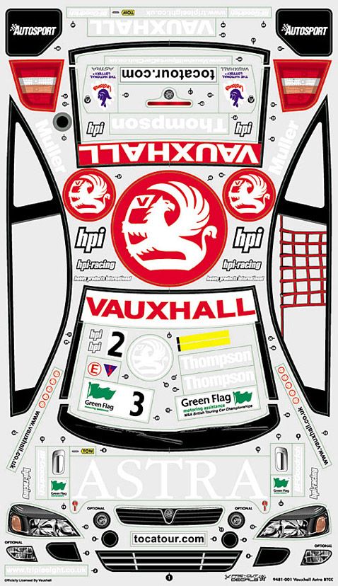
Hope you will enjoy this image of branded Vauxhall rally car, which I found while looking for the logo materials …

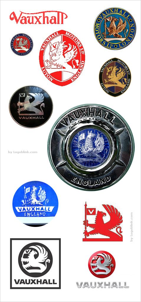
As well as this collection of other Vauxhall logos :


