* New information commented in late 2012 at the end of the post
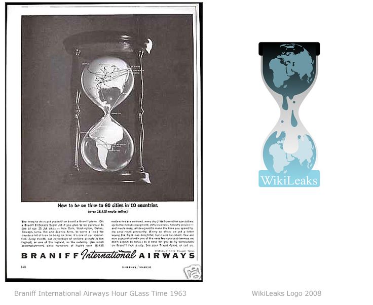
During another brand research I’ve stumbled across this interesting ad from 1963 and remembered the WikiLeaks logo. All the thoughts bellow are pure speculation and are based on indirect graphical evidences.
Is this Wikileaks logo a rip-off ?
Although they are too similar, I’m sure it’s not on purpose and the second logo is just the same by coincidence. Just two common ideas. Why I think so ? Because if you are man of truth , a man who has principles you’ll never rip off a logo. And the Wikileaks are men of honor, right ?
Who designed the wikileaks logo ?
No idea. I couldn’t find any design credit. But… one thing is known ( as you can look more closely in the profile subpage of the logo in wikipedia ): the logo is officially uploaded ( created ? ) in 2008. Probably the origin is Europe – the map on the upper more visible globe is Europe, not North America ( as in the most logos ).
Why so detailed ?
I guess the logo was created as an article illustration. Few years back nobody knew who were/was Wikileaks. No images, no data, nothing. And when you don’t have a picture you draw one wich should represent the idea. Again – the scenario could be different.
Why the globe ?
The logo suffers from the “syndrome of the globe” . All the small companies wants logos with global elements to make them look huge. The Wikileaks network was small at some point and they needed something “big” to represent them. What’s bigger than the globe ? And besides – a “world conspiracy theory” sells best.
Do you think it needs re-design?
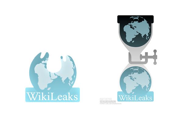
Yes, absolutely. The logo is too vertical and people already started using a cropped version – only the lower part of the sand-watch. See the pictures bellow. Also the image is already recognizable enough so it could be simplified a bit. Without any banal gradients, of course.
Does somebody tried to do this already ?
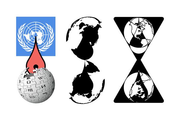
Yes, some dudes from Holland called “Metahaven” made some logo proposals . To see some logo developments click here or here.


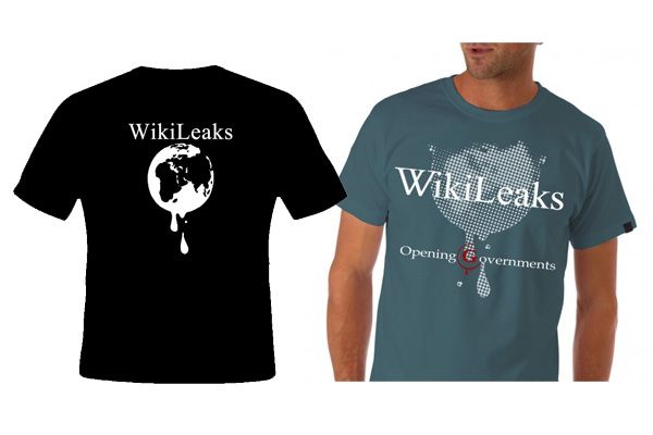
Check also sevensheaven.nl for some more Wikileaks logo spoof.
Or propose your version of the WikiLeaks logo identity by using the comments bellow :)
Well, at least the post provoked some additional info. If anybody knows something more – it will be great to share!