In this post I will introduce you with more detail to the creation, different uses, and variations of the famous McDonald’s logo. That’s right – the golden arches. Similarly to Starbucks, McDonald’s is a global powerful corporate player and one of the pioneers in the fast food restaurant chains business.
Likewise all businesses, it started on a small scale with a single location in Southern California. In 1937, McDonald’s was first a restaurant that sold hot dogs, orange juice, coffee and tea. Then, it was moved to San Bernardino and it was converted to a BBQ restaurant. Soon after, an investigation of sales showed that hamburgers accounted for 80% of the items sold. That is how the switch was made – from a BBQ to a fast food chain. For more on McDonald’s history click here.
Now, let’s focus on the logo :
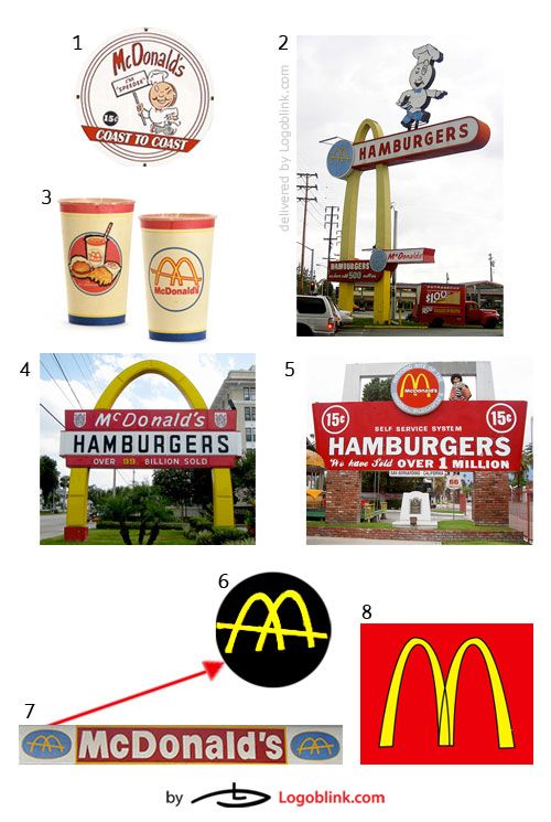
In the begining there was the chef character named “Speedee” ( #1 and #2. ) Then, in 1953, the arches were introduced. One of the founders, Dick McDonald sketched a pair of stylized yellow arches on both sides of the new outlet in Phoenix, Arizona. On #5 is one of the McDonald’s history museum locations. When the arches are viewed from an angle they resemble the letter M. From this reminiscence came the concept of the new logo, introduced in 1962, and designed by Jim Schindler.
The vintage cup on #3 is a McDonald’s waxed paper cup from the 1960s for milkshakes. It is part of “The All American” advertising campaign ran by McDonald’s at the time.
The logo expert Andy Payne, creative director of Interbrand, said: “The interesting thing about this logo is that it was born of architecture. The arches were a design to be used in a building and that has created the unique nature of the “M”. It does rely on colour, in that you might not recognise it as McDonald’s if it was not yellow and red.” Later on, in 1968, the name ‘McDonald’s’ was adjoined with the McDonald’s logo.
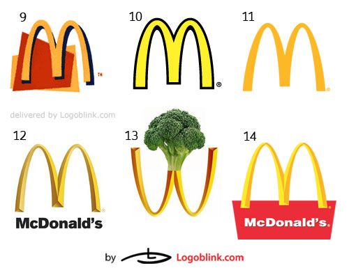
There are numerous variations of the arches as you can easily see here. What is the difference you might ask? Well, to me it was fascinating to try to decipher the different advertising messages that a variation in the shape, color tint and color choice, orientation and size, could propose. For example, in #12 to #14, the edges **are sharper, which speaks of a more solid, business-like and corporate character. On the contrary, **#10 apparently targets a funnier, happier, and more casual audience. This ‘M’ is used mainly when advertising to children. The wider arches, the brighter yellow, and the imitation of a drawing are all elements that contribute to the attempted young-spirited vision. Another use of wider arches is when the logo is utilized as a street/road sign – the thicker arches are seen easier from the passing cars. On famouslogos.org there is an analysis which contributes to the statement above: “The simpler the font of the logo, the more radiant it becomes for the spectator.”
The psychology of the colours used is another widely discussed topic, especially when it comes to advertising. The red is believed to be the colour of agressiveness, passion, vitality, and strength. Furthermore, it is known to raise blood pressure and evoke hunger. The logo design of McDonald’s is using a loosely analogous color palette with a dominant yellow. “Yellow, much like red, can have conflicting messages. It can represent sunshine and happiness or caution and cowardice. Yellow is bright and highly visible which is why it can often be found on caution and other road signs. Yellow is often used in logo design to get attention, create happiness and warmth.” (colors info 1, 2). May be that is why most of McDonald’s road signs are lighted in bright yellow, while the interior of the restaurants is usually accompanied by red couches and accessories.
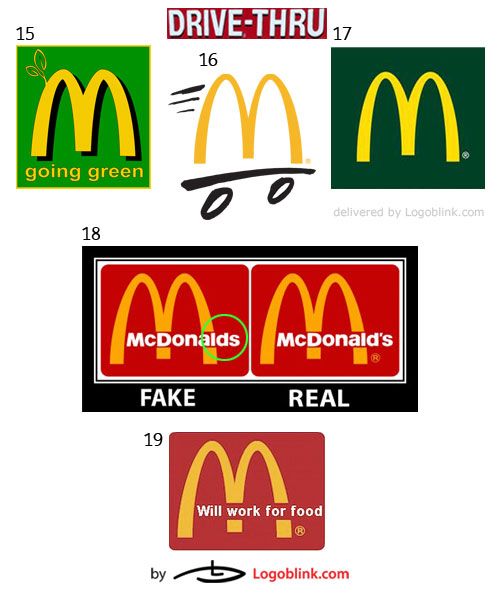
Nowadays, there is a lot of social pressure on big corporations to be “greener” and McDonald’s acts correspondingly. They launched an energy efficiency project according to which most of their restaurants will be transformed into greener and self-sustainable buildings in the near future. For the time being, the first LEED®-Gold restaurant is located in Chicago. Apparently, they used the green color in #15, 17 in order to communicate the newly adopted practices.
As for #16, it is the easily recognizable Drive-thru logo – the ‘M’ (the logo metaphor for the restaurant) on wheels. #18 shows the difference between the fake and real logo on red background. I can spot that McDonald’s has a tendency for using much more only the golden arches as compared to using the arches with the letter inscription “McDonald’s”. Of course, this happened progressively with the years, once the ‘M’ transformed into an icon of the fast-food restaurant.
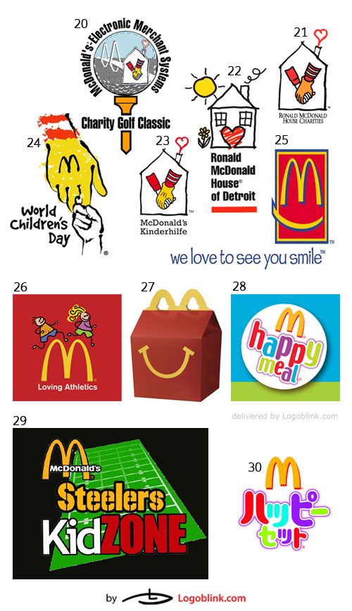
Ronald McDonald a clown brand character that goes hand in hand with every McDonald’s restaurant. For years, McDonald’s has been critisized for its vigourous advertising, targeted at children. To every person, knowledgeable of basic marketing concepts, it is obvious that the fast-food chain aims at getting children as customers, provoking emotional bondage and, consequentially, converting them in loyal customers once they grow up. Bright and fun colours, as well as, thick, easy to recognize lettering are accompanying the happy meal packaging. (see #30-Japanese Happy Meal, #29, #28, #27, and #26 – Loving Athletics, behind which flashes the promotion of a healthier lifestyle for children).
As for Ronald McDonald, he became the most famous clown among North American children, may be even among children worldwide. (I wonder if “It” by Stephen King has something to do with Ronald – may be a malicious cousin? ;) #20-24 all represent logos of the Ronald McDonald’s Charity House. The logo of the house is easily associated with McDonald’s not only because of the ‘M’ on Ronald’s glove, but also simply by the use of colours – #22 – the yellow sun + the red heart.
“We love to see you smile” is a wide known McDonald’s slogan. In #25 you can see that along with the mentioned slogan, there is a stylized logo with an added smile. Everyone that had ever worked in McDonald’s knows that smiling is one of the laws of good customer service. The multinational company seeks to achieve an emotional bondage on a personal level with its customer.

This next banner compiles logos used by McDonald’s for their corporate and employees’ team along with different sports sponsorships initiated by the multinational.
#31 stands for the newly launched StationM, which is a blog where employees from around Canada and USA can share their experiences and thoughts. #32 and #34 are representing the new logo that the franchise is using to mark a restaurant with an internet access – the ‘M’ substitutes the ‘A’ in the @ – clear and simple. #33 is a logo used for McDonald’s LIVE Tour featuring musical guests and free concerts across the USA. As you can see, the unmistakable ‘M’ can be transformed and inscribed in nearly anything – that is why it is considered to be a winning design.
#35 is the new Manager’s News and Crew News set of masthead logos, designed by Faust, for the in-house publications of McDonald’s Corporation. Faust created complementary logos and layouts that projected professionalism, friendliness, and association with the McDonald’s “i’m lovin’ it” feel.
McDonald’s corporation suffered a lot of bad word of mouth and accusations of promoting unhealthy lifestyle. But either to counteract or for some other reason, the multinational has been involved widely in sponsoring sports events and whole tournaments. It is one of the official Olympics partners and its logo is usually depicted next to the relevent Olympics one (#36-37). #39-45 are showing McDonald’s involvement in All American High School Basketball Games that have been organized for more than 32 years now. #46-50 respectively represent the sponsorship of soccer tournaments. ‘I’m lovin’ it’ is complemented by ‘keep kicking’ .
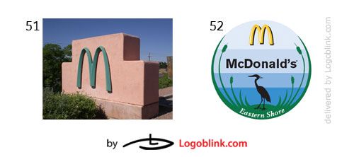
You might be wondering why the ‘M’ is greenish in #51? Is it really a McDonald’s or some fake double? It is a McDonald’s, but it is located in Sedona and is subject to the city’s zoning laws. The latter called for the restaurant to agree to construct teal arches and to lower the sign to the ground so it’s not a public eyesore.
#52 is one of the 20 restaurants which are locally owned and operated by Baxter Enterprises Incorporated, a family business. I included this one because it shows how the McDonald’s franchise is subject to local differences not only on a worldwide scale, but also on a national level.
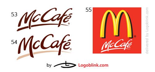
The banner above is pretty self-explanatory – the relatively new McCafe, again walking hand in hand with the golden arches and containing the ‘Mc’-prefix. An interesting fact is that the McCafe is spreading fast enough to perform as an direct competitor of Starbucks.
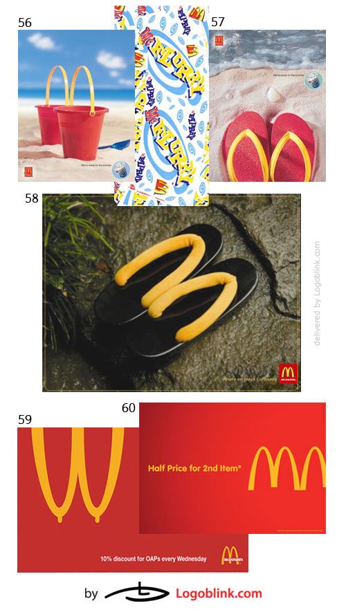
I also included a series of print ads which I find effective and creative in the interpretations of the golden arches logo. For example, in the McFlurry ads – #56-57– the flip-flops and the sand buckets instantly inflict a summer feeling, while at the same time, reinforcing the ‘M’-arches.
#59 is a little bit controversial and I believe that McDonald’s signed it off at some point. As to #60, I find it is a brilliant brand concept to use 3 arches to portray the half price of the second item (1 item= 1 ‘M’).
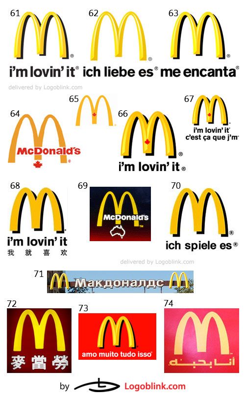
As I mentioned above, McDonald’s varies from country to country. There are not only different items on the menu, but the slogans and the signs are slightly diverse. For example, only in Canada the ‘M’ has a maple leaf in the middle (#64-67) and the slogan “I’m lovin’ it” is translated in Canadian French. #62 is the German variant – the arches are more sharp most probably due to the orientation of Germans towards professionalism, stability and perfectionism. In #69, the map-like outline of Australia is suggesting the location of the McDonald’s. #71 is in Cyrillic, #74-in Arab, #73-Portoguese, and so forth. Every restaurant is designed in a way to accomodate the particularities and cultural differences across the world – for example, in France, the restaurants have much more European look, the red is a lot darker, and the interior and exterior design are resembling old-school sandwich/lunch/brunch places.
[[ the McDonalds Brandbook posted here was removed after a request from the company ]]
A restriction found on McDonald’s website states the following: “Do not use “Mc” or “Mac” to create a new word that is not associated with McDonald’s, such as the word “McMansion” to describe a large home.“ But in reality, there are couple words, that are compiled from the ‘Mc’ prefix + the word itself, which are widely used. In his book “The McDonaldization of Society”, George Ritzer describes McDonaldization as the process by which the society assumes the characteristics of a fast-food restaurant. Yet, another example is McJob, which stays for “[…]a low-paying, low-prestige job that requires few skills and offers very little chance of intracompany advancement.”
I have already talked a bit about coulouring. Now I will investigate the symbolism of the arch. Of course, no final conclusions can be made, and certainly, the information on the meaning of colour in psychology is much more reliable than the one found on symbolism of arches. In general, to an arch is referred as to a gateway, a door to something beyond, or a passageway. Arches are also widely used in brigde construction (the bridge is a form of a passageway, see also #90;). Furtheron, as I read logotales.com, the arches may signify a shelter under which you can get a refuge, or a safe place to have your break and eat. Another interpretation I found logoorange.com, is that “… [the company] called the logo Golden arches firstly, to input the idea that owning one McDonald’s franchise is like having a gold mine.” As a result, this logo is labelled as “part of Americanization and American cultural imperialism”

As in the Starbucks Logo Mania post, I will try not to take any side, I will try to stay objective and unprejudiced, will avoid criticism and attempt to deliver only food for thought. All the big corporations like McDonald’s are being often criticized and accused of wrong and ambiguous practices. At the same time, there is a flip side of the coin – the more money they earn, the more they give out to charity. Among many other criticisms, McDonald’s has been held liable for some of the deforestation of the Amazonia, and it has been accused of promoting the fast food meat diet and, thus, increasing obesity levels.
In #75, there is a conspiracy theory involved, namely, the Two Pillars of Freemasonry and the Golden Arches of McDonald’s. In this theory, the arches are explained to contain hidden meaning and symbolism. If you take a closer look at #75, you will see that “[…] the Golden Arches intercept both the central, and outer edges of the letters McDonald’s, therefore slicing the word up, using pyramid numerology – 12321. The letters highlighted by the Golden Arches, can be rearranged to spell the word ****Mason.” It is an interesting theory, but I cannot account for its truthfulness and I will leave the judgement to you.
#79 is a referral to the ‘McLibel’ lawsuit, in which two British activists were being sued by the McDonald’s Corporation for distributing information that was damaging to McDonald’s reputation. You can read more about the emblematic lawsuit here. The rest of the collection presented above is mainly taken from political/anti-McDonald’s corporate practices campaigns. One of the biggest organizations dealing with protesting against exploitation and wrong advertising practices of the giant of fast-food restaurant business is McSpotlight.
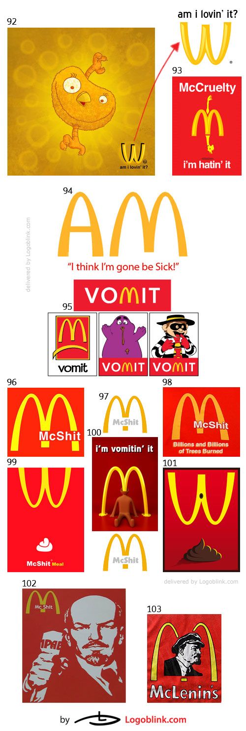
The banner above is the second part of the Anti – McDonald’s campaigns and protests. The arches are flipped horizontally in #92, 99, and #101, the slogan for the McCruelty campaign is transformed to the provocative question “am i lovin’ it?” or simply “i’m hatin’ it”. The motivation behind this campaign is clearly portrayed by the visual aids and the transformation of McDonald’s packaging, logo, and slogan.
Many documentaries like the 2004 “Super Size Me” criticize the quality and nutritional facts about the food sold in McDonald’s. McShit obviously is aiming at the same target. And it seems that the problem is not so much the bad food, but more the indulgence in overconsumption of fast-food due to the promotion of such lifestyle.
To most post-communist countries like Russia, Czech Republic, Poland, Bulgaria, Ukraine, and the rest included in the Eastern European communist bloc, the coming of McDonald’s usually symbolized the end of the cold war and the dawn of capitalism. But is it better? Is the McLenin (#103) just a juxtaposition of Capitalism to Communism or is it a sign of the equality/similarity between the two?
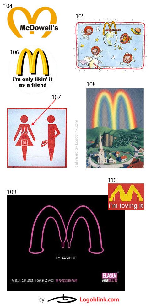
In the logo collection above, I have compiled funnier images with creative messages. #104 is a just an imitation of a real McDonald’s restaurant. It was used in the movie “Coming to America”– to me it seems as one of the abundant publicity stunts, used by McDonald’s or any other American corporate giant, to popularize the American Dream. #105, 106, 108, 110 are self-explanatory. #109 and #107 are my favourites – #107 features couple of the emblematic American brands on a washroom pictogram, while #109 chose to start from the slogan “i’m lovin’ it” and then analogously tie in the two condoms in the ‘M’. __
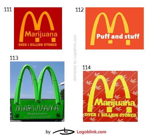
As you can see from this marijuana collection, the ‘McDonald’s’ name is substituted by ‘Marijuana’ or ‘Puff and Stuff’ in #112, while the slogan “Over 1 billion sold’ is taken over by ‘Over 1 billion stoned’. On #113, the road sign was painted green and changed to read “Over 8 million rolled dude”.
Compared to Starbucks, it seems that McDonald’s has much less trials for imitation or blatant rip-offs of their logo. It is quite obvious that #116-118 are attempts of copying McDonald’s brand identity. #115 cannot be viewed as a rip off since it belongs to the McDonald’s corporation. It is again a simple variation of the original McDonald’s logo – this time there is only one arch or half of the ‘M’, which is being transformed to an ‘H’ for hotel. Unlike McDonald’s restaurants, the Golden Arch Hotel, with its four stars, is targeting the high end business/leisure segment.
#116 is an obvious rip-off – the arhes are slightly different, the ‘Mc’ is present , the main colours used are similar, even though, not as bright as in McDonald’s. In #118, located in Russia, the colours seem identical to those of ‘McDo‘ (the way they call McDonald’s in French Canada) and “Mak” is the equivalent of “Mc” in Cyrillic.
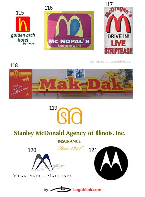
#119-121 are just examples of other companies that use the arch as an element in the creation of their logo. In #119, the arch is wider in order to accomodate the ‘s’ and ‘a’ underneath the ‘M’. With #120 they are more skewed and, last but not least, the well known Motorola logo (#121) resembles the most the arches of a bridge.
In conclusion, I have to say that the Golden Arches logo has become an insignia of the multinational business expansion. The red and yellow colours are still regarded as a stamp of business traits of the fast-food industry. The ‘M’ has grown to be used as a synonym of capitalism or globalization. Along with Coca-Cola, Nike, and Starbucks, McDonald’s sticks unforgettably into the consumer’s mind as simply American in origin and absolutely global in citizenship. With it’s design simplicity and unique forms , the logo conveys in a very good manner this message.


