We have all heard of the athletic rooster, or as it is more famous – Le Coq Sportif. The triangular (in most cases) logo with the rooster can be seen on variety of shoes, shorts, t-shirts and other sports equipment. Whereas the French company producing sports clothing originated back in 1882, the first branded products were available on the market from 1948. This is when Le Coq Sportif came up…
An ambigram is an art form that can be read in the same way from another viewpoint or orientation. John Langdon and Scott Kim are the two artists who have been most responsible for the popularization of ambigrams. Douglas R. Hofstadter has focused his research on the sense of “I”, consciousness, analogy-making, artistic creation and etc. He describes an ambigram as a “calligraphic design that…
Basically, the tourism logo of the country serves to represent it. It’s like the national flag, but aimed at tourists, not governments and geography students. The creation of such a design is a massive responsibility and there are always people who are rooting for or against a certain logo design as there is always someone who thinks the design could be improved. A few years back we shared here a…
American Airlines is one of the most popular airlines in the world. They have been around for about 80 years now and have changed their logo design a few times. You can see the evolution of the AA logos, compiled by designboom.com, here: The last one is the American’s new logo design, changed on 17th January 2013. Except for this time they didn’t only change the logo but rebranded everything. In…
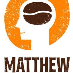
As the coffee is my favorite everyday drink I did a research on the coffee brands and their logos from around the world. I’ve collected the most interesting of the famous coffee logos for you to see here! Enjoy them:) It’s interesting how different the approach to each logo design is. The company’s logo is the most important part of the corporate identity. Therefore, brand logos should…
Last year I was invited by my friend and colleague Tiago Lemos to visit Portugal. So it happened that in 2012 the city of Guimaraes, Portugal was the European Capital of culture. The city is famous for its museums, plenty of monuments, cultural associations, art galleries and popular festivities. During the time it was the capital of culture you could see the graphic identity designs for the…
You probably know the best online software for presentations out there – PREZI. Recently they have changed their brand identity. It’s now more “blueish” and more cold-corporate. The logotype is more conventional. Personally I like the funny two-way-“r”. The “e” is the already popular “smiled-haineken E” In case you wonder where the mark comes from and why it’s so detailed for a logo – it’s…
The logo a company adopts is just as important as the name and the marketing strategy. You want the logo to show the business in the most positive and effective light. To give some examples of how a logo should be created, let’s use the example of a fictional web based poker company which is just starting up. What should be considered during the designing process? Do your research Research is the…
These is a short preview of how the new “Microsoft” rebrand trend could influence the other companies :) Although this picture is a spoof, it’s interesting that the Bulgarian ICN logo ( bottom right ) is actually a real logo that is in use for some years already. The company is a well known hosting and domain name provider in the country.