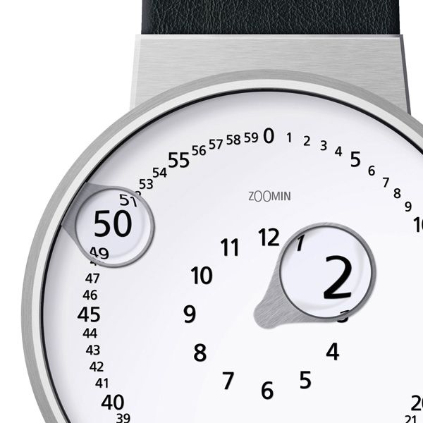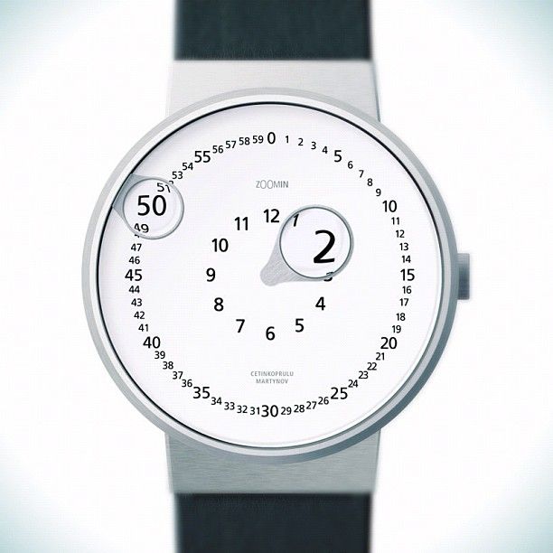
The zOOmin watch is a nice concept product design. With a nice small logotype. The double “OO” looks like eyes and divides the “zoom” into “zoo-m”, which highlights the “min” ( minutes ) idea. And this rises the question : Isn’t the good naming idea actually a half done logotype design… ?

spotted in http://www.yankodesign.com/2011/03/16/what-big-hands-you-have/


