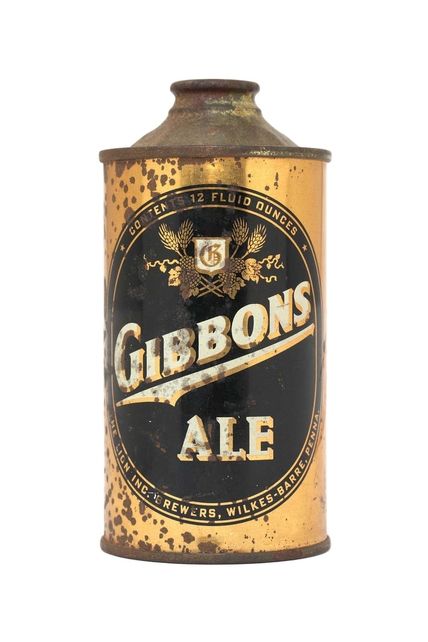
1 – The Lion Brewery Inc 1930s-1940s. May be we can define “Gibbons” as a good example of true oldschool American logotype. The colors are great, too.
A new coffee table-topper from Chronicle Books, Beer: A Genuine Collection of Cans , peers into the 1,400-plus collection of beer can-enthusiast John Russo and presents nearly 500 of the most interesting finds that represent craft breweries now out of business and iconic brands that have continually altered their image throughout the last half decade. Compiled by Dan Becker (Russo’s stepson) and Lance Wilson ( both live and work in San Fran ), the book is a glimpse of drinking days of yore and an ode to the long lost cone top and crowntainer cans. Bottoms up!
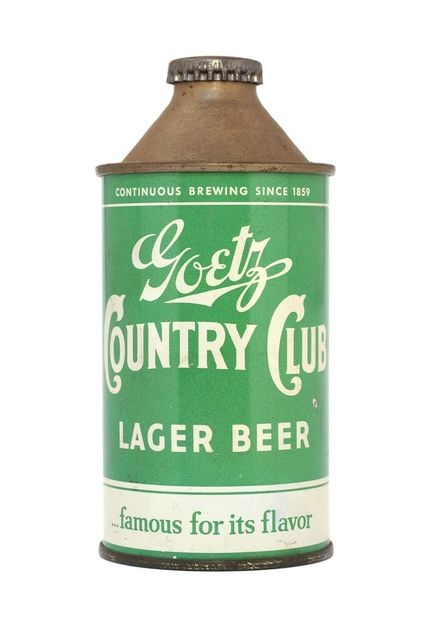
2 – MK Goetz Brewing Co 1940s-1950s. The Goetz logotype is really inspiring.
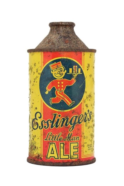
3 – Esslingers Inc Brewery 1940s-1950s. Cool character and also pay attention to the “drunk” Ess in the logotype. Sweet.
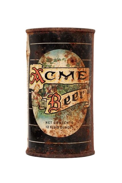
4 – Acme Brewing Company 1950s. Interesting type, right ? It’s weird that the words are not parallel.
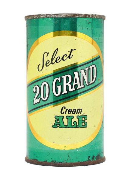
5 – Red Top Bewing Co 1950s. Great color combination. I’m sure this design would sell even nowadays. I like the curly bottom of the “2”.
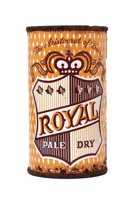
6 – Maier Bewing Co 1950s. I can’t stop associating this with the Billabong designs for some reason :)
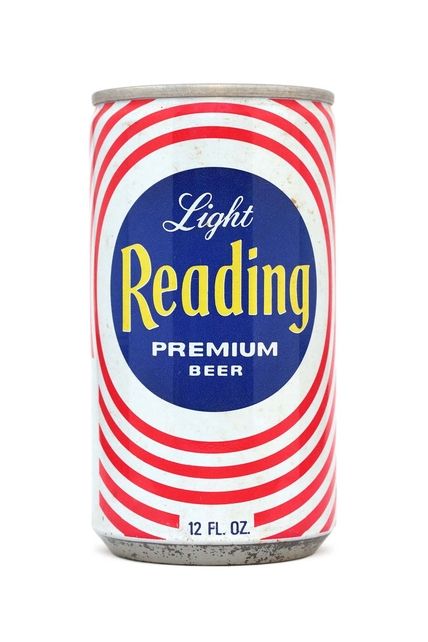
7 – Reading Brewing Co 1970s. May be Heineken took the idea of the smiled “e” from here. Who knows .. :)
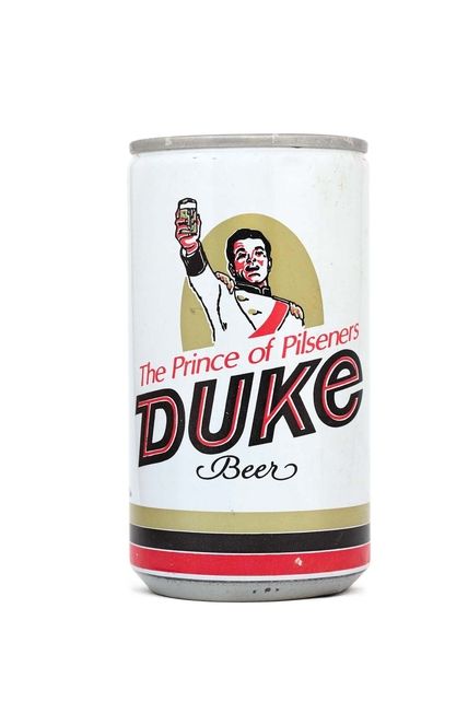
8 – Duquesne Brewing Company 1970s-1980s. It’s a small charming Beer down there…
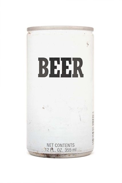
9 – Falstaff Brewing Co 1980s. CLEEAN.
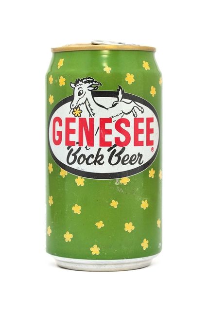
10 – Genesee Bewing Co Inc 1980s-1990s .More like a cheese logo for me, but it’s a fun design concept.
Via: dwell.com
PS: btw – the book costs just 13.45 USD :)