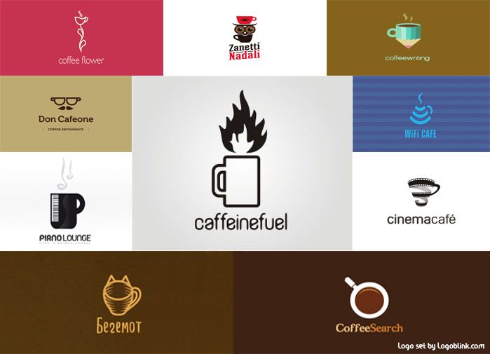
When it comes to logo design for coffee shop or cafeteria there aren’t a lot of different choices for symbols that we could use. Coffee cups and coffee granules, warm colors and specific typography are some of the most commonly used elements in this kind of graphic design. But that doesn’t mean that the commonly used symbols couldn’t stand with different appeals in a different ways for different consumers. Better prepare a cup of nice coffee for yourself, because we’re about to go trough 10 wonderful logo examples, designed for these cozy places where we all love to spend the afternoons with friends, books or music.
1. Don Cafeone
Don Corleone + Caffeine = Don Cafeone. A name that’s easy to remember and refers to a classic character, which contains the appeal for power, domination and supremacy. Notable name and powerful context – looks like this place doesn’t need something else in order to be remembered, but it has – the distinctive logo. Stylized face with mustaches and glasses that resemblance with a pair cups of coffee. The face, on the other hand, refers to Don Corleone’s image from the famous movie.
2. Wi-fi cafe
In our digital world a lot of cafes began to function not only as a place where to read a chapter of a book while you’re on the go, but also like a stopover for people in need of internet. Here’s a logo that perfectly represents the idea of such a place. The classic w-fi icon stylized as a coffee cup. Clearly once you see it on the street you’ll know that it’s a place where you could open your laptop while drinking up a cup of coffee without anyone wondering why you sit alone.
3. Begemot cafe
Though nowadays a lot of the urban cafes function like a wi-fi stopovers, there are still an exceptions. One of them is Begemot cafe, where people still spend coffee company with books. If you don’t know what Begemot stands for, then it’s probably because you are a wi-fi cafe goer. Begemot is the speaking cat character from Mikhail Bulgakov‘s classic novel “The Master and Margarita”. The logo represents a cup of coffee stylized as a catty head which perfectly goes with the concept of the place. I don’t know about the wi-fi cafes, but as a good book reader I’d choose that one for sure.
4. Caffeinefuel
Clearly the designer of this logo asked himself the two most important whys: “Why do people drink coffee?” – The answer is because it contains caffeine. And: “Why do some people need caffeine?” – Because it acts as stimulant and makes them feel awaken and alert. So the logo of Caffeinefuel represents the perfect metaphor to the reason why we drink coffee. As the different kind of fuels fill the cars and planes up with the necessary ingredients to drive, the cup of coffee also brings drive-up fuel to the body and mind. Looks like there was a designer that understood that better than anyone.
5. Zanetti Nadali
Zanetti Nadali’s logo features the aforementioned awakening effect of the caffeine. Two cups of coffee stylized as an owl – that’s the main thing you’ll probably notice about the logo. The owl is a night bird, which is recognizable with her eyes wide opened – the effect we all need when waking up early in the morning in need of caffeine. The logo is original and attracts those consumers who are familiar with the coffee’s effect of freshness.
6. Coffee Flower
Coffee flower’s logo looks like stylized flower that blooms with the shape of a cup of coffee. It stands for freshness but appeals it in a more different way than the aforementioned logos do. The pink background is designed to attract the female consumers’ attention. Cafeterias after all are some of the favorite chit-chat places for the most of the women and that one successfully fits the concept.
7. Coffee writing
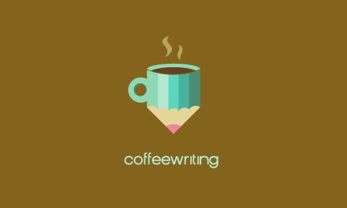
Since there are readers, there must be and writers. And looks like somebody was smart enough and had the thought for a place that could serve to those people as a stopover, where they can do their job while drinking up a cup of coffee. Though Coffee writing features the trivial cup of coffee symbol, the logo is specifically designed to invite in a specific group of people. And what’s more appealing to a writer than cup of coffee stylized as a pen?
8. Coffee search
Coffee search‘s logo features a cup of coffee looked from above. However the image brings another reference with itself which stands for magnifying glass – an object that we’ve all seen at least once in a situation of ourselves or someone else searching for something. It’s simple and fully mirrors the brand’s name and concept.
9. Piano lounge
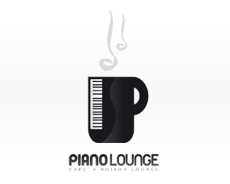
There are cafes for internet addicted, for book readers and why not for piano music lovers **as well? Piano Lounge’s logo makes it clear that it’s a place where every music lover would feel great – stylized cup of coffee which resembles a **piano desk. Black and white, stylish and descriptive – surely an invitation to anyone who has a taste for the music.
10. cinema cafe
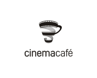
After the music there comes the cinema and the places that gather the movie fans over a cup of coffee. There we see one simple and nice logo of such a place that features a movie length stylized as… guess what? Yes, a beautiful cup of coffee. There are probably thousands of other places that use the same symbol, but the important thing here is that this cup of coffee represents a specific feature, that makes the place a unique stopover for people with common interests.
The originality does not always takes just a unique symbol. Sometimes what makes a logo original is the way the symbol appeals to the audience. As we saw with those 10 coffee shops logos one symbol could appeal and stand in many different ways evading the cliches. All we need to do is think and ask ourselves the question ‘Why?’ until we find the right answer.
