New York’s Metropolitan Museum of Art is about to make a major change in its logo design. The information came up from Justin Davidson from Vulture and according to him the Museum will present new contemporary logo on March 1st. The logo is designed by Wolff Olins, a global branding company.
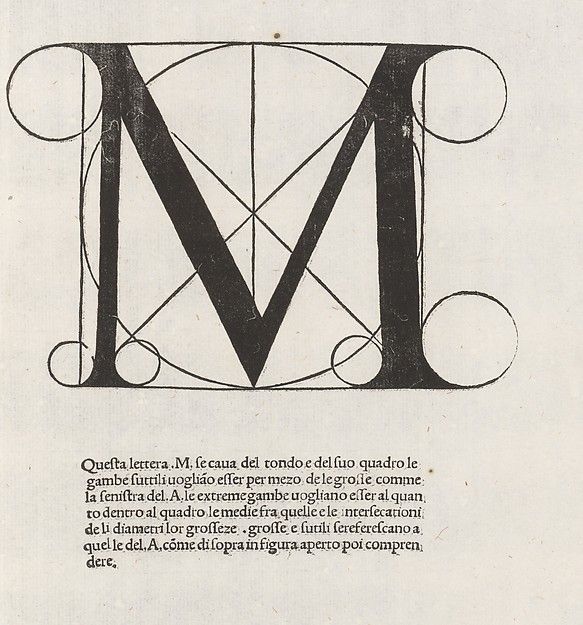
Davidson shares an image of MET’s new logo in his article. The new logo compared to the current one, which was adapted in 1971, is dramatically different.The original sign was designed after Leonardo da Vinci. It overlays the letter M on a circle and a square. There are small circles that rest on each serif. The whole composition recalls the proportional geometry of Leonardo’s Vitruvian Man drawing.

MET’s current logo
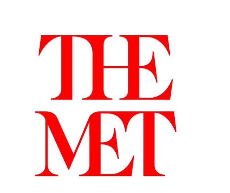
However, what we see in the new logo is two-tiered design that features “THE MET” written in red letters. The author of the article says that “the whole ensemble looks like a red double-decker bus that has stopped short, shoving the passengers into each other’s backs.”. Harsh words.

The Metropolitan Museum of Art’s new logo. Photo: Wolff Olins, courtesy the Metropolitan Museum of Art.
After the word for the new logo spread over twitter through Vulture’s profile, a reaction followed. Users started proposing their own designs and improvements for the new logo.
Maybe @metmuseum wants to rebrand entire city with bad logo, starting w baseball @JDavidsonNYC @vulture pic.twitter.com/lRSEMquKV5
— David Herman (@DHermanStudio) February 18, 2016
However, there are also people who are fine with the changes. Or at least don’t mind them.
Can’t we just accept no logo is ever going to please everyone and move on?#Met
— Mike (@miksullivan) February 19, 2016
NY Times reports, that MET has issues the following statement regarding their new logo:
The new logo no longer relies on symbols and, instead, is based on the commonly used name “The Met,” which has an immediacy that speaks to all audiences. It is an original drawing, a hybrid that combines and connects serif and sans serif, classical and modern letterforms. In this respect, it reflects the scope of the Museum’s collection and the connections that exist within it. There may be debate about the logo because it involves change, but the museum chose it because it represents something simple, bold, and indisputable: The Met is here for everyone.