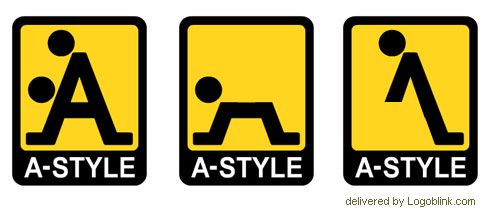
A-style is a clothing brand. The brand exists since 2003 (or at least the domain a-style.it is registered during that year). However, 2006 could be considered as a real breakthrough. Later a friend of mine sent me an A-style key holder from Italy. If I have to be honest I didn’t get the idea at first sight… but later there was the “LOL” effect. :) Cool idea, designed in a nice way. Everything is on purpose in the design of this sign. The shape of the logo design in its original version resembles a street sign. The yellow background is a reference to pictograms and all “caution” signs. The proportions of the “head” and the “body” fit the style of the most used pictos, too. So there’s every prerequisite for finding the true meaning of the “A” letter and the two dots.

This picture is from the official website. When the parts are analysed separately the logo reveals its full potential and the logo hidden meaning. ;)


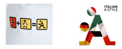
Bonus A-style logo interpretations :

What do you think about the logo ?
What about wearing this brand ?
Do you love signs whose real meaning reveals at second sight ?