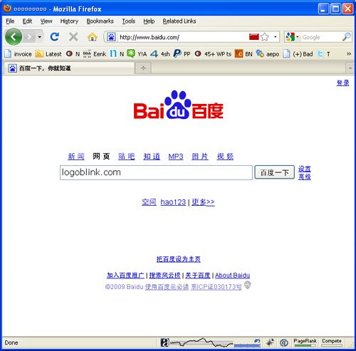
In this very moment – Baidu.com is # 9 most visited site in the world ( Alexa ranking ). Get used to it, because it’s the chinese “Google”.. and soon or late it will become THE MOST RECOGNIZABLE LOGO in the web… and in the world :)
Here’s what we read in Wikipedia :
Interesting is the name itself :
Baidu was mentioned in an antient chinese poem. The literal meaning is “hundreds of times”, represents persistent search for the ideal.
It’s typical textbook case of commercial web logo – mix of two or more colors, the logotype is both in english and chinese with round sans-serif font. The dominant color is the most popular color in the country – red ( because of the national flag and all the propaganda ). It took me a few minutes to understand why there’s a paw / pad. Okey, animal signs and images are always working in a marketing point of view … but the main reason should be because the paw mark is a symbol of a track, of going after something, a search symbol. It’s really interesting and different from the magnifier cliche :)