The superheroes we all know from movies and comics are always hiding their true identity and that’s why they express their presence with other symbols like outfits, phrases and as some of the most famous companies nowadays – with logo. The curious thing about the heroes is that their logos are perfectly fitted to the guidelines the corporate world uses today – they are recognizable and original. Their signs had their own evolution trough the years, but the main concept has been kept till nowadays. It’s worth opening a word about it because these logos have proven timeless, sticky and fundamental qualities in the graphic design. And that’s something we love to talk about.
** Superman Logo**
Superman‘s logo is probably the most popular and influential among other superhero logotypes. It became one of the key symbols in the world of comics, which was carried trough TV series and big screen production in the last 20th century. The logo stands mostly for power and strength, which is directly expressed with the shape of diamond. The “S” represents the hero’s nickname, but it’s widely considered that also refer to the names of its creators – Siegel and Shuster. The contrasting colors of yellow and red are directly connected with the mythology – yellow is the color of the sun on Earth and red is the color of the sun on Krypton – the energy that activates and deactivates the power of Superman respectively on each place.
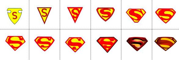
Originally the logo was much more simple and consisted only of the red “S” letter stuck on a yellow shield, that resembled a police badge. Trough the years it was modified many times before reaching the shape we know today.
Batman Logo
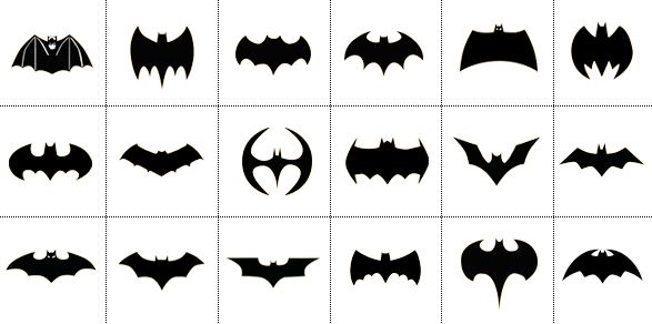
Batman‘s logo is another popular icon in the graphic culture of comics. Though Batman doesn’t have superpowers like Superman, he’s a character that could be identified by anyone who’s having an eye over the simple stylized silhouette of a bat in flight , which by the way is his logo. The symbol had its own evolution as well and has been changed in various shapes trough the years. Batman has integrated his black-and-yellow logo as a brand probably more that any other superhero – it’s on his outfit, car, motorcycle, gadgets and even in the sky, when he warns the bad guys to watch out. Whether the bat’s silhouette is in yellow or in black turns to be of no importance – it’s equally alive in both ways. Which is more than awesome.
Surely we have much to learn from these superheroes, especially when we have to create an image that has to endure for a long time further. Many companies pay huge amounts of money to graphic design agencies in order to find the sign that will make them stand out internationally, but maybe they just need to ask some superhero. Perhaps logo design is a skill that passes only on special occasions like the accidents that grant a hero with superpower ;)


