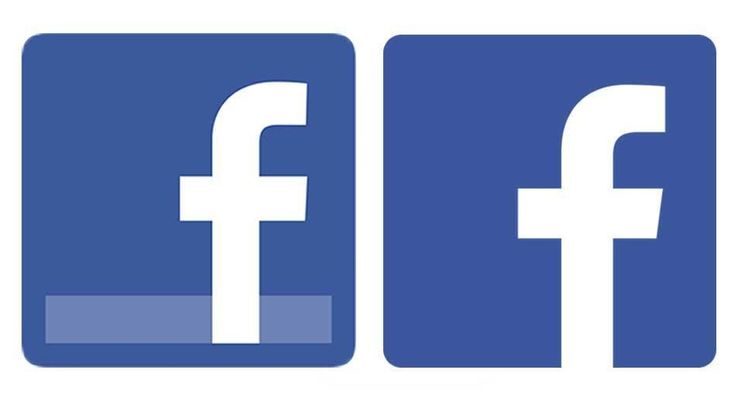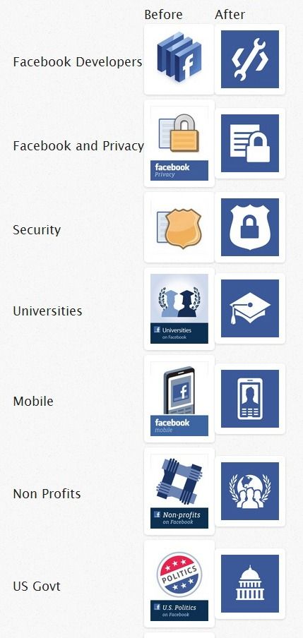
With the introduction of Facebook Graph Search new design elements appeared and some existing ones changed. Probably we can define this as the rebranding of Facebook in year 2013. You probably can already see this images in the design of your facebook profile page.
Probably the reason for changing the new logo was the idea of making it negative in the top bar.
This logo design move is turning the regular web logo into more classic-like logo where the shape could be use in a great way both in positive and negative cases. It’s the top of the iceberg of the new cross-platform facebook design innovation.


photos via Tom Waddington