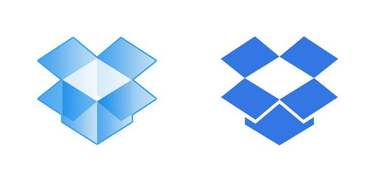
This was inevitable.
Moving from a “gradient web icon” to a classic logo is always a matter of time. Yes, that’s why it’s called a logo, not an “icon”. It has certain graphic advantages and could be used everywhere. On cakes, on uniforms, on extremely small scale, etc. This is the real sign that Dropbox is moving to another level. The level where it’s not enough to have something like a web illustration that should represent a billion dollar company. Well done.
What do you think about the Dropbox logo redesign ?