…
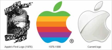
Although this ridiculous Apple logo design from 1976 looks like an 1876 emblem, this picture represents the evolution of logos very well. Apple is a technology company and can afford to redesign its symbol in any moment. However, companies like UPS will not do this soon because the UPS logo is used on too many print materials. If you are not aware, the cost of full-color-print is still times more expansive than the one-color print or the representation of the logo with a cut folio. We should also add the difficulty of printing perfect or even correct gradients. This is the same reason why Firefox logo is also so colorful and full with gradients. The media where the logo is used defines it’s look. Now let’s talk about the similarities between the web 2.0 logos.
Primary characteristics:
1 – usage of gradients
2 – usage of bright colors
3 – usage of non-serif fonts
4 – usage of shadows
5 – reflection ( under or over the body )
6 – looks like web glossy buttons
7 – often made by a “logo generators”
8 – stands for a website, web service or interface, created after 2004
Non-primary characteristics :
9 – speech bubble shapes
10 – spheres and other easy to fabricate “3d” shapes
11 – usage of strokes
12 – usage of “badges”
13 – small “beta” notice
14 – rounded corners
15 – rectangular background
16 – consist of a small icon + word mark
17 – the word mark writes a strange or non-existing word
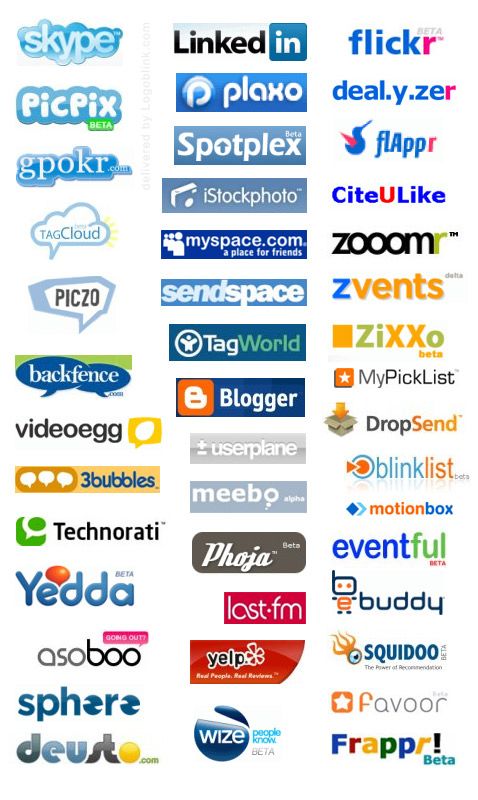
Here are some logos, defined by the internet users as “web 2.0 logos”, which will illustrate this characteristics:
Why do people create such logos ?
Some web 2.0 logos are interesting (e.g. e-buddy), some are even original (flickr). The truth is that most of them are bad designs or just copies. Maybe we should blame developers who are trying to come up with a brilliant design idea for a few minutes on Photoshop. Or maybe, designers who don’t engage themselves personally with the project and serve the “I want one just like this, but can you change it a little bit?” clients.
Anyway – let’s go though the characteristics:
1,2 – privileges of the new media
3 – symbol of new age (serifs are associated with old times)
4,5 – result of a Photoshop usage for a logo tool (the same tool websites are designed with)
6 – usually one can click on the logo (and people like shiny stuff)
7 – the fact that a lot of people need a logo design, but are not willing to pay a designer.
8 – the name of the website should be visibly declared
9 – community sites are the most popular and therefore need a decent identification like a logo.
10 – people like shiny visions and 3D (or both!)
11 – common feature in Photoshop
12 – nice place to put “BETA” in
13 – “beta” is fashionable now
14 – also symbols of the new age + looks more “teen”
15 – rectangular backgrounds are the safety net for bad designed word mark.
16 – what does your desktop have ? icons. You’ll easily understand and get used to another one.
17 – one can not buy google.com domain name, but boogle.com could be free…
“While they are pretty cool, they are all kinda the same.”
This is written by the creator of web 2.0 generator.
The quote actually references the main disadvantage of this type of logos.
—
Another approach to understand the psychology of this type of logos is to understand what web 2.0 is. Here’s what Wikipedia says about it :
Web 2.0 is a trend in World Wide Web technology, and web design, a second generation of web-based communities and hosted services such as social-networking sites, wikis, blogs, and folksonomies, which aim to facilitate creativity, information sharing, collaboration, and sharing among users. It is almost defined as the new era of the World Wide Web. The term became notable after the first O’Reilly Media Web 2.0 conference in 2004. Although the term suggests a new version of the World Wide Web, it does not refer to an update to any technical specifications, but to changes in the ways software developers and end-users use webs. According to Tim O’Reilly:
“Web 2.0 is the business revolution in the computer industry caused by the move to the Internet as platform, and an attempt to understand the rules for success on that new platform. ”
Some technology experts, notably Tim Berners-Lee, have questioned whether one can use the term in a meaningful way, since many of the technology components of “Web 2.0” have existed since the early days of the Web.
—
Maybe these sites really need web 2.0 logos. I don’t know. For everybody else who need a decent logo, but their budget is quite limited – check www.desbar.eu. This is a Design Barter forum, where you can ask for your own logo and give credits in return. The motto of this website is “Every good idea deserves a design and every good designer deserves a field for action”.
The quality of the web 2.0 logos could be easily defined. I don’t see any web 2.0 logos in “www.eulda.com/2007 “, what about you? What does this tell to you? :) You can make a visualization of a good idea without gradients and reflections.
If you can’t – you better visit Logoblink.com more often :) Though, I should admit I have a favorite one – the green Sony Ericsson symbol. It looks just perfect on the phones and in every advertisement. I assume it’s a web 2.0 logo / icon.
.
.
.
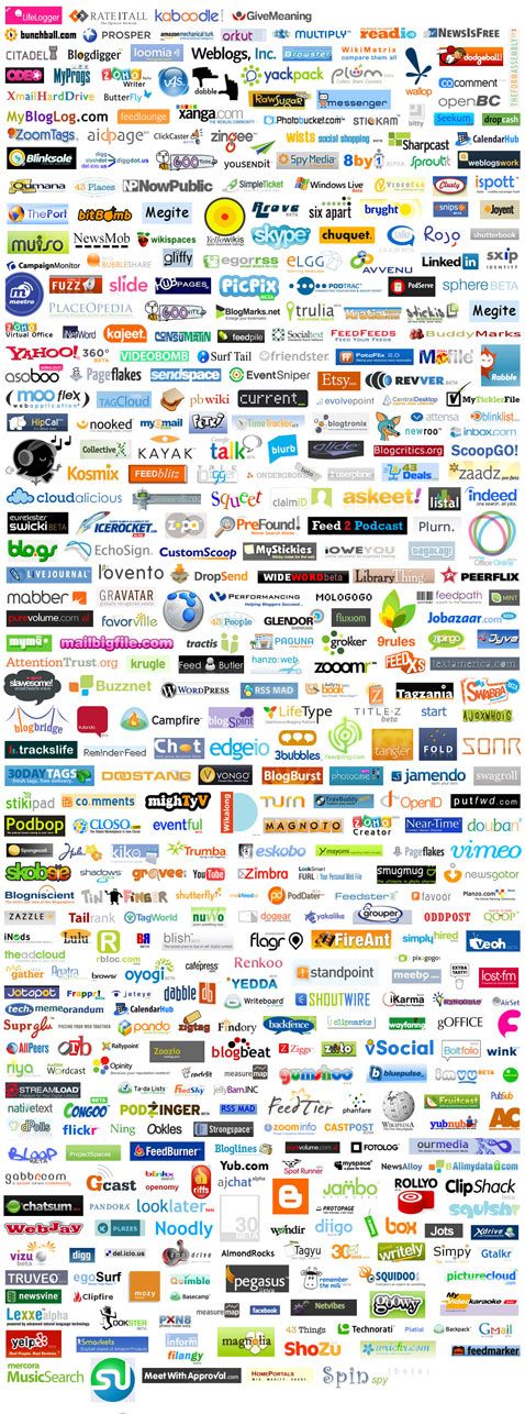
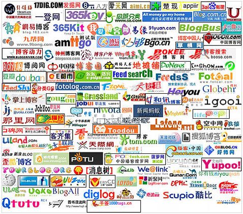
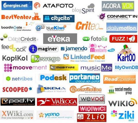
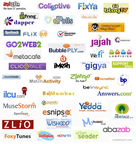
And, yes, web 2.0 logos are international:
US sites
Chinese sites
French sites
Israeli sites
.
Some sources from which you can get an extra idea what the web 2.0 logos are:
