Ford Motor Company is one of the most famous multinational automakers in the world. Founded back in 1903, the company has changed its logo several times. The current logo design is very famous:

According to the company the Ford brand book is published in order to “restate what the brand is about”. I have uploaded a few screens from the brand guidelines which you can see below. The brand guidelines book itself can be downloaded from the link at the bottom of the article.

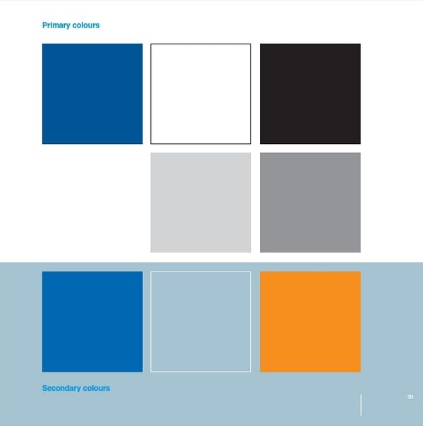
This is the current Ford Motor Company colour palette. According to the brand book the second palette (which includes orange) is now used alongside the primary colours in order to give a more emotional expression to the Ford brand.

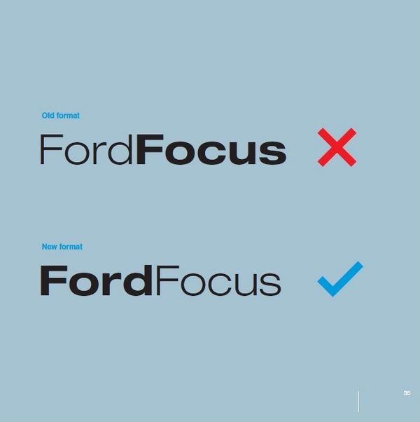
The Ford guidelines are strict about what text should be bolded. The current rules from the brand book suggest that only the brand name should be written in bold, whereas model names and other should not be.

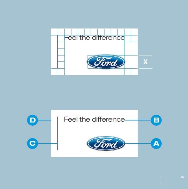
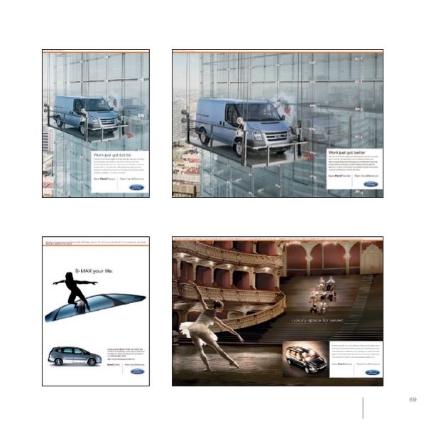
There are very strict specifications concerning the Ford brand box that is present on stationery and advertising materials. Above you can see the guidelines, and below – the brand box in action (the photos are quite low quality, but this is what is in the brand book.

The company has guidelines on the product photography as well – exterior, interior etc. This is an example for exterior photography. The rest of the photos you can find in the .pdf file.

DOWNLOAD THE PDF / 7.4 MB, 100 pages of Ford guidelines