No, Honeywell is not rebranding :) It’s just another visually stable brand* that deserves recognition.
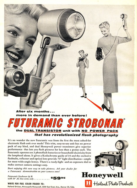
From the 1950s until the mid-1970s, Honeywell was the United States’ importer of Pentax cameras and photographic equipment. These products were labeled Honeywell Pentax in the U.S. Under Binger’s stewardship from 1961 to 1978 he expanded the company into such fields as defense, aerospace, computers and cameras.
The following diagram is a result of my personal research and it might not be 100% correct. The logos bellow are taken from products and print materials.
![]()
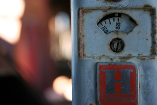
The primal direction is – going from discreet serif to a non-serif logotype, migrating from black to red. The only mark used is the first letter H in a frame with a tiny logotype “honeywell” that was later replaced by just a line… and at the end it was removed. The present logotype is NOT a font. It’s a custom typo. The little difference between the last two logos ( the black and the red ) is that they’ve made the letters a bit slender. It’s best visible if you look at the “e” and the “y”.


Resources:
https://en.wikipedia.org/wiki/Honeywell
http://www.scripophily.net/hohespcoin19.html
http://www.tias.com/cgi-bin/showcase-item.cgi?itemKey=1923019897&store=/stores/mspackratz
![]()
It’s a big pdf document, almost like a textbook how to make brand design, but for me, this is the most interesting page, because you can’t see everyday this thing in a guideline. It’s an interesting process how the main logo will replace any existing one in a few simple and logical steps. Intentionally or not – the example migrating brand logo looks Arabic.
It’s an interesting fact that Honeywell do not have any official slogan. This is what they say on their webpage.
*visually stable brand – another term, invented by Logoblink to describe brands that preserved their visual identity very well through the years.


