We have all heard of the athletic rooster, or as it is more famous – Le Coq Sportif. The triangular (in most cases) logo with the rooster can be seen on variety of shoes, shorts, t-shirts and other sports equipment. Whereas the French company producing sports clothing originated back in 1882, the first branded products were available on the market from 1948. This is when Le Coq Sportif came up with their first logo design focusing on the rooster as does the name of the company. This is due to the reference to the Gallic rooster – an unofficial national symbol of France. Throughout the years the logo has been changed a few times since then. Below we have compiled the logo evolution of Le Coq Sportif as it is presented on their website.
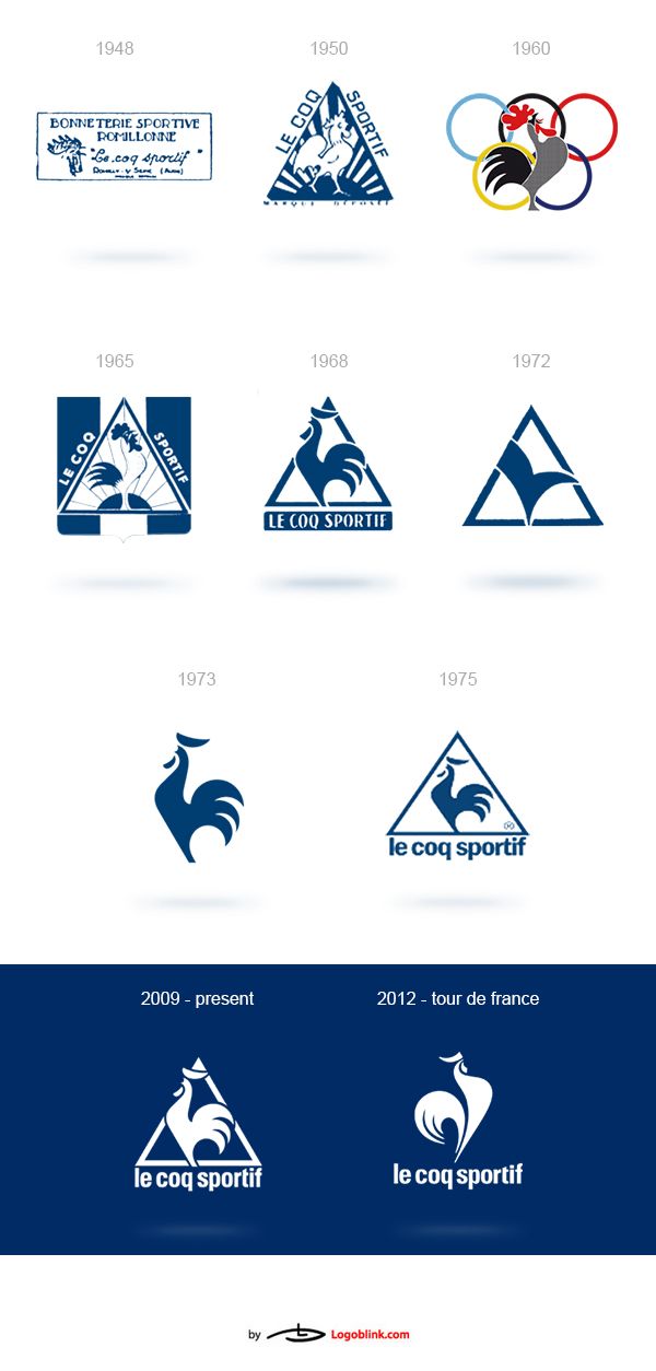
The image above shows how the logo has maintained the key element – the rooster within a triangle. However, the depiction of the bird is in some cases too abstract and only by knowing what the previous logos of the company looked like could one guess the true meaning behind the check-sign from 1972. The logo design from 1975 has stuck the longest – almost 35 years. Still, in 2009 Le Coq Sportif changed the design of their logo to their old 1965 logo with one main change – the different logotype. The current design is being used in most of the company’s products, except for the new yellow jersey design and its subsequent products which are part of the company’s Tour de France brand. This is because in 2012 the French company decided to freshen up the logo and announced a new, customised logo design for the jerseys as it can be seen below.
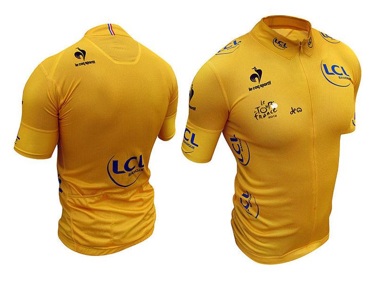
It should be mentioned that Le Coq Sportif is the official uniform supplier of many teams playing various sports, including football, boxing, rugby. However, the company produces sports equipment for many other sports hence why the ads of the French company often include players of different sports.
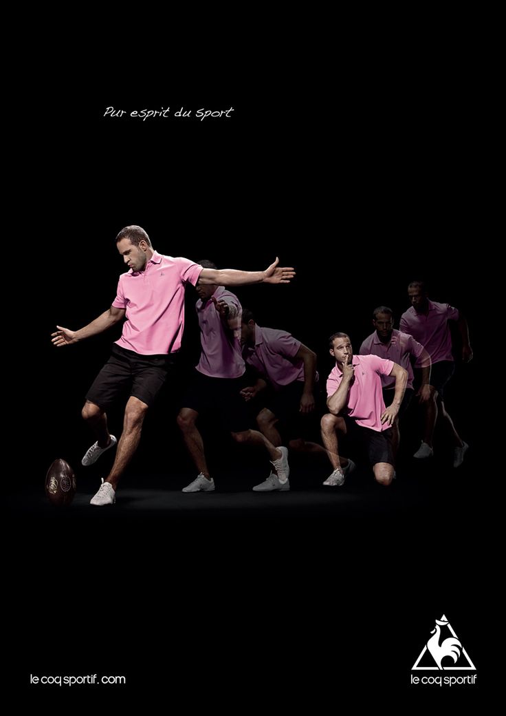
Here we have picked out a few interesting poster designs by Le Coq Sportif with the new logo:


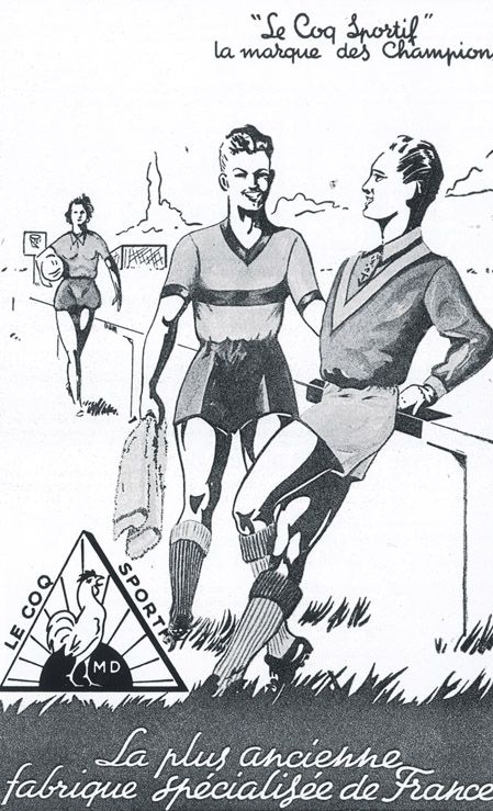
Here are some old-school posters from the 50’s and 60’s based on the logo design that is visible:
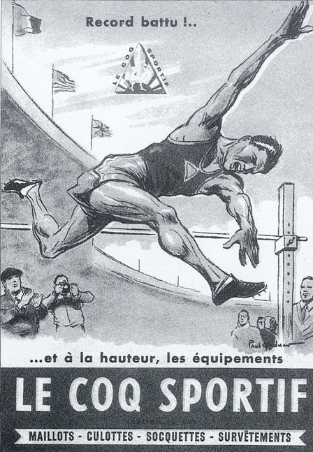
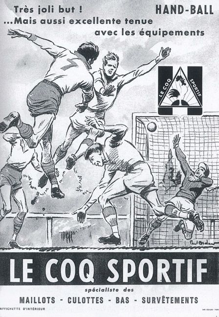
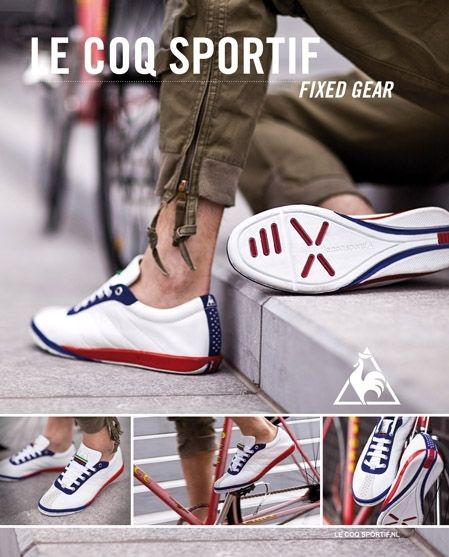
In the following ads you can see the positioning of the logo in the advertising strategy of the company.
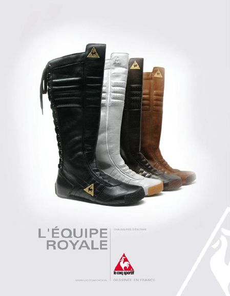
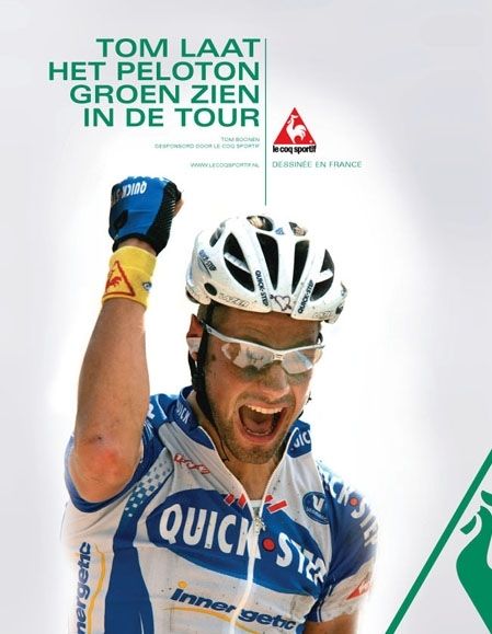

Finally, if you like to know more about the history of Le Coq Sportif you might find this video interesting:


