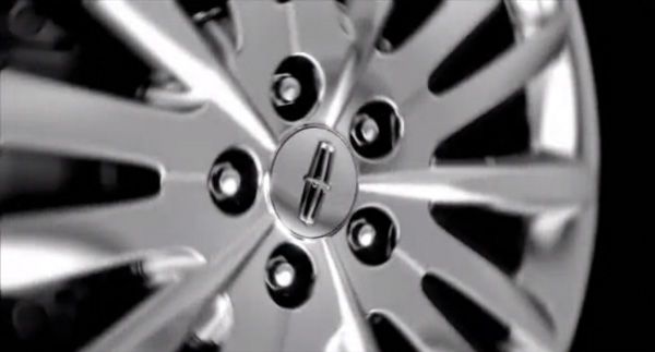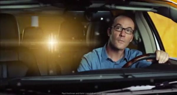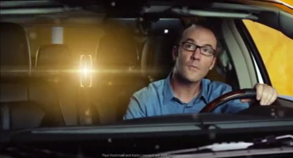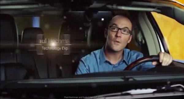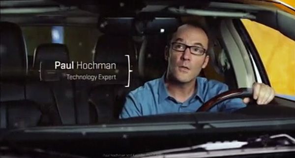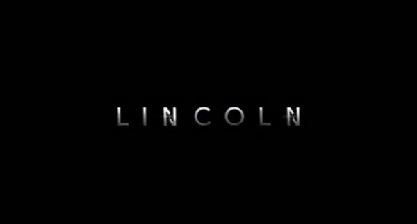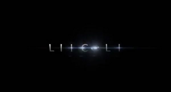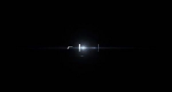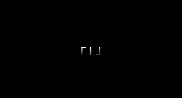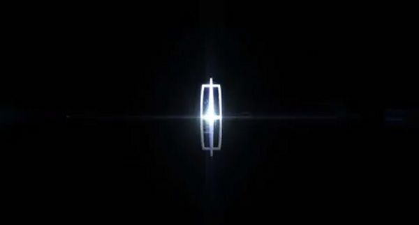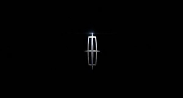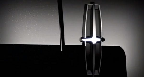
You can see in every car commercial the badge of the brand lighted in some pretty cool way. And that’s awesome usage of the pastic of the form. I’m showing the following screens and the video because the motion designers managed to get the most of the logo in every aspect – the opening shots, in the movie titles and in the closing brand motion animation.
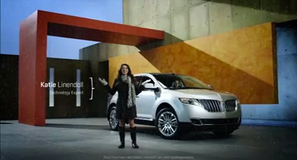
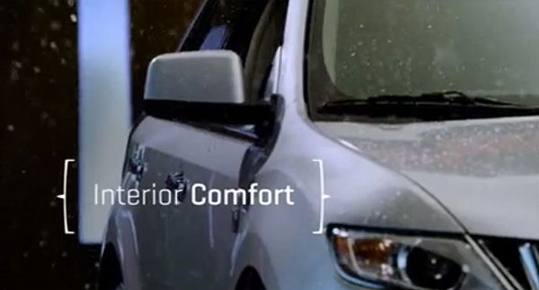
Some logos are just constructed very well and allow great dissection and separate elements usage. This is the case with the Lincoln star in the frame. The pure geometry is suitable for many motion animations. For example – above you can see the logo opening space for the titles as two brackets.
Another variation with only one bracket and more light.
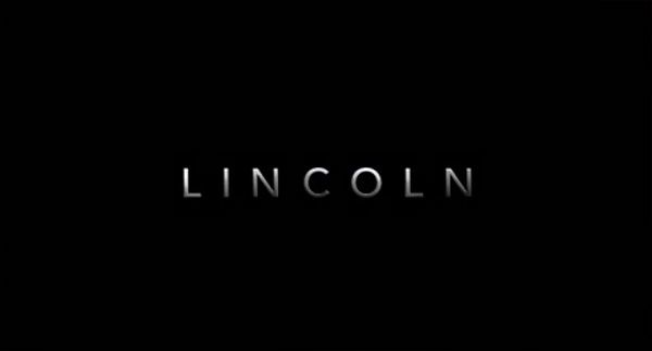
This is the closing brand motion design that really made me share the movie. You can watch in the final 4 seconds of the video. The concept with the L-s of the logotype, becoming the frames of the mark deserves recognition, doesn’t it ?
Actually I like the whole ad campaign.
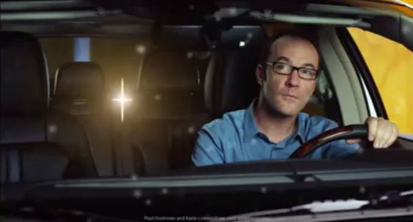
And in this one the logo is transforming once again into the web adress : lincoln.com, rotating itself in the final phase under 90 degrees, so that the same approach doesn’t look boring. Also if you watch carefully – in the beginning (00:10) the star from the logo is used as a touch symbol,too.
