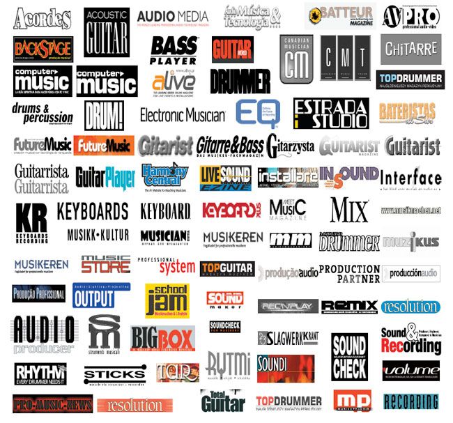
I found this logo set based on music magazine logo designs and logotypes weeks ago, so unfortunately I can not credit anybody (don’t remember the source), but still – it’s a decent selection. Nice job, man! Whoever you are.
A quick preview tells you the style is about instruments naming, rectangular backgrounds. There are more logotypes than marks, notable usage of basic colors – black, white, blue, red, yellow.. nothing brave like pink or bright green.
I like the approach of the red ‘Keyboard’ logotype in the center. Also the distinctive ‘Rhytmi’ typo (center down). However, in the latter case I think that something should be done with the “i” at the end. :)
PS: Don’t know if the “notes” as a shape are too naive for these designers, but I see none around. I’m wondering why…
