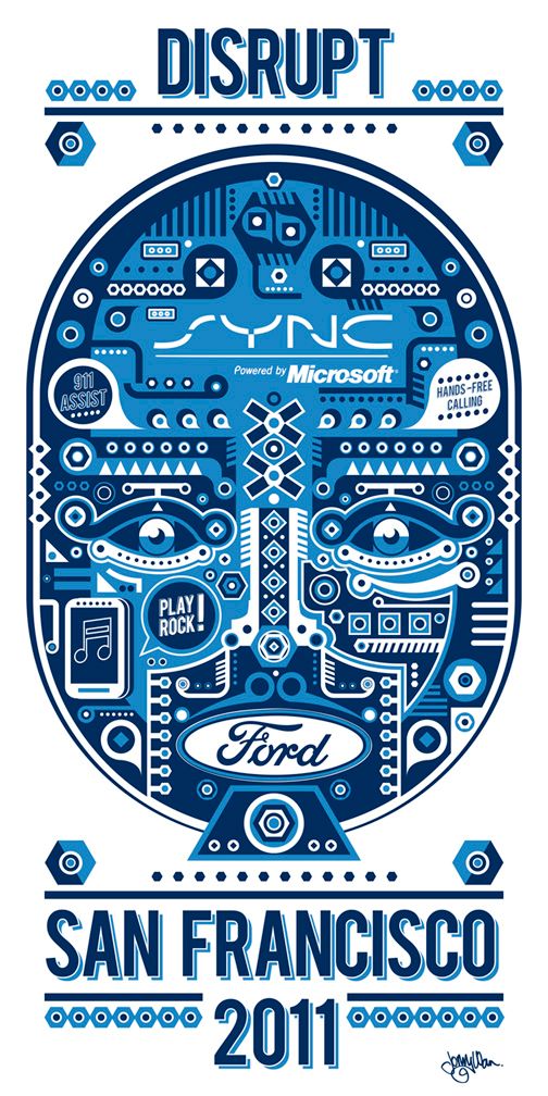
Johny Wan sent a link to this peace yesterday. First thought – okey, I’ve seen this type of style before… it’s catchy, but where’s the logo story ?
After that I saw the logos in the illustration and start thinking that this is actually something not very common. Probably Johny just wanted to showcase his art, but what I’m interested is the aspect of integrating the brand into an image in an organic way.
Usually in all kind of advertisements the logo / brand mark is isolated and this is not very beneficial for the whole art itself.
Yeah, we all know the brand guidelines and the visibility issue, but may be this is the future – to put the veggie meal between two hams , so that people could still enjoy it ( it’s a metaphor, I’m personally trying to reduce the meat, don’t want to offend anybody ). A brand advertisement dressed like a brit art, right ?
Everybody tried stuff like this – where the logo is not only a part of the composition, but a part from the main image… and who succeeded to sell it to the clients ? As far as I know none of my colleagues designers. Okey, may be it also depends on adjustment of the brand-director ( of SYNC and FORD in this case ), but still – here it is – approved ( as far as I know ) branded piece of art, that’s gonna become more trendy with every year :)
Good news for the artists, right ?
PS: visit Johny here.