“Most metros have logos or symbols to mark their station entrances, rolling stock, and printed matter such as maps or tickets. Since most metro systems around the world are indeed called ‘metros’ (other less-used names around the world include subway, underground, U-Bahn, T-bana or something else), many metro logos are more or less fancy variations of the letter M.
There are different kinds of metro logo designs. In some cities a logo stands for the metro system itself. In other cities various logos are found within a single metro systems which represent the companies that are operating the metro lines. So there may be more than one logo in use in one city while in another a logo can consistently stand for a system or even for several metro systems within a country. Country-wide use of a single logo is found in Germany, Italy, Spain and, to a limited extent, Russia. All German metros (U-Bahns) use a blue U logo and all German S-Bahn-type suburban railways bear a green S logo. Most Italian cities use a red M logo for metros. All Spanish suburban railways have the same red C logo. Many Russian metro cities are using derived variations of the same sloped red letter M of the Moscow metro.
Due to these differences in usage, the following list can merely give a rough overview. If a city uses a logo for the metro system itself, the list will prefer it over any company logos and omit the latter. The logos have been obtained from websites, maps or schedules found on the Internet, or scanned. In order to make them comparable they have been scaled to a standard size while trying to maintain maximum accuracy and quality. Logos are protected by copyright of their owners; the low-resolution images of the logos presented here are for informational purpose only.”
text by mic-ro.com/metro/metrologos.html
& some Logoblink notes:
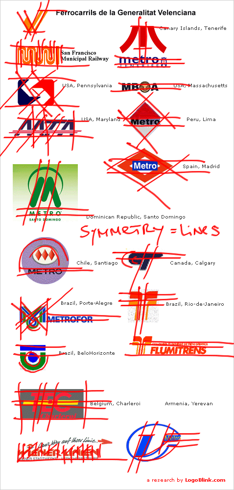
One can see that most of the shapes are easy to reproduce with any material – plastic sign, metal cut, stencil paint… I believe this should be an essential approach to every logo. It’s a fact that 93 out of the 170 logos are designed in one color. Simple practicality and budget efficiency. OK, the letter M is quite obvious, but another common thing is the symmetry. No matter what the shape is it always suggests rail lines. You don’t have to understand the local language to find the “two lines that lie below the surface of the city”. It just strikes you at the enter of the subway…


… and some bonus logos:
other sources:
www.ottawatransit.ca/metro.html
