You gonna see this logo around very soon. It’s the new “Decision Engine” by Microsoft. Another smart search engine. It’s not online yet, but we expect it soon on www.bing.com . The provided EPS file bellow is vectorized by Logoblink.com and it’s NOT the official logo, but it’s 99% identical, so I think it’s OK to use it.
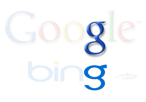
Looking for first time at the logo I should say that it’s not irritating. Which is a success itself :) Blue seems to be a nice color choice. A classic blue + orange should work well. The typo is rounded, but not the typical dummy web2.0. It’s obvious – they’ve tried to preserve the more business look and yet to keep the logotype friendly enough. The word is just 4 letters and the “i” seems to be the first thing to “touch” in the logotype design. Pay attention that Google and Yahoo and Windows logotypes are with capital letters, but here we have only small ones. This is a feature of the new style in logotypes. More friendly, more humble, more like a nickname from some IRC chat… but more difficult to read in between some text. The “g” is more talkative for some reason. Could it be, because they wanted to leave the impression of something similar to the second “g” in Google ?
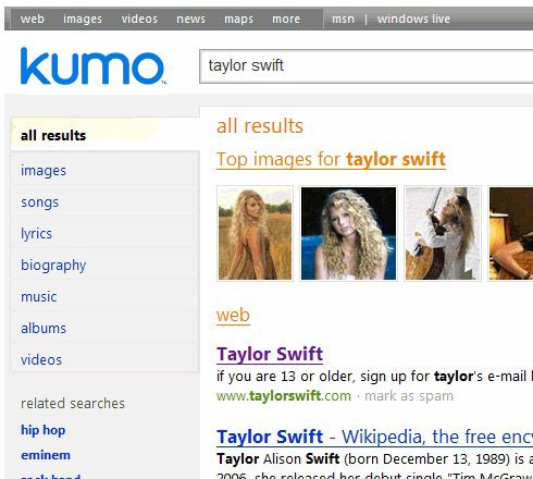
A stylish blue gradient is logical for such a logo, but it’s not there for a few reasons. As far as it could be seen from the video preview – the logo is gonna be placed over various images, so they are gonna use in various color palettes. And using gradients will make it one step more complicated. On the other hand Yahoo are using shadows and Google are using shadows and gradients, why not make a difference by not using anything and keep the things simple enough… Another factor is the visual legacy of the “KUMO” logo. Kumo is the first name this site was first announced with before some time. Again 4 small letters, again blue, but they updated the idea with orange dot and more straight lines at the end of the main strokes. After all – it’s a hard task to make something that will be liked by such a large demographic, so why risk with additional logo design elements.
They say that there’s a huge advertising budget for this new “decision engine” . Speculations vary mainly from 60 to 100 million dollars. If this is true, the logo will appear in a looooot of materials and using plain colors is a smart move.
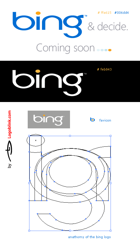
Here come some more BING logos that you gonna find if you search in google and some other places. The first one is a chat for mobile phones that suspiciously was renamed TODAY. The new name is going to be “blinko”. Or at least this is what it was written on the www.bing.im before I’ve started to write this post… Now there’s a new website in this webaddress. Anyway – the cool black ambigram on the second row is for a chinese marketing studio ( if I’m not wrong ). The next ambigram for the Bing Surfs ( more Bing surf logos down in the post ).
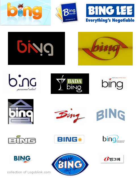
In my opinion the naming of the BING is brilliant for a few reasons. Mainly because it’s short, sounds cool, it’s an asian surname ( next few years China will be the largest population that will speak english ) and last but not least – there’s a surf brand with a decent history with the same name. So the old phrase that we will be “surfing the net” could appear fashionable again.

There are also a few “custom ordered” bing surf logos in the site ” classicbingsurfboards.com” that deserve to be seen, so go and check them! You could also find these Logoblink posts interesting:
