Basically, the tourism logo of the country serves to represent it. It’s like the national flag, but aimed at tourists, not governments and geography students. The creation of such a design is a massive responsibility and there are always people who are rooting for or against a certain logo design as there is always someone who thinks the design could be improved. A few years back we shared here a logo set of famous tourism logo designs of 50 countries and regions. But designs get old and have to be changed or at least refined.
This is the old tourism logo of Belize:

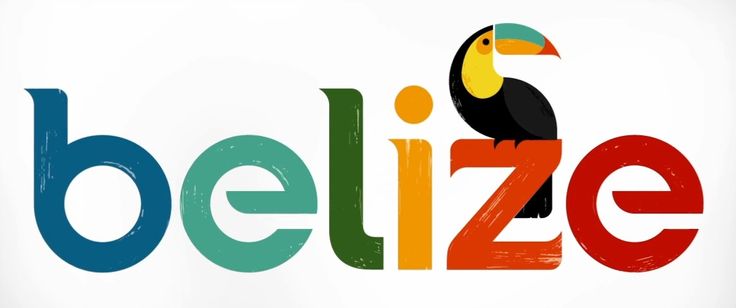
The new one was announced on 11th January 2013. It may seem similar based on the simplistic logotype of the name of the country and the presence of the toucan. However, it is different. This is the new tourism logo design of Belize and you can find all the information concerning the new design in the video below.

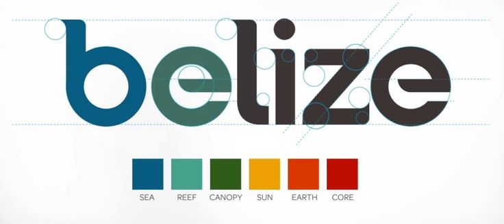
Although the logo design looks nice when presented in a larger size, one must bear in mind that when published in a smaller size the brushes as detail will not be visible. However, the tourism logo is colourful and cheerful. The main geometrical figure used is the circle, and the colours are chosen to represent parts of the nature of Belize.

You can find all the information concerning the new design in the video below.
Belize Designing A Nation from Olson on Vimeo.