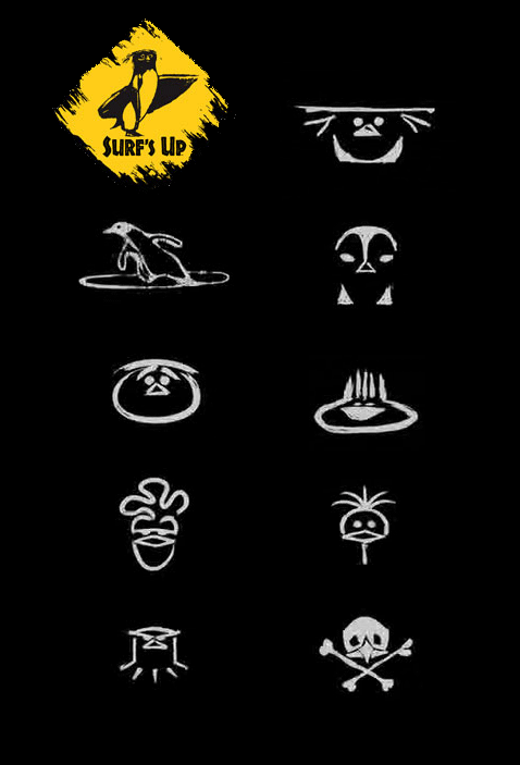
There’s a movie called “Surf’s Up“. A nice penguin-surf animated story with humor and cool music. And logos. The logos bellow ( except for the yellow one ) are a part of the closing titles. They are used right next to the people’s names and identify the certain movie character they developed. Really simple, but used in an effective way. Why ? First – the image is too simple and it gives you time to focus on the name, the person ( wich is the most importain in a closing title ). Second – the logo style is quite different from the style of animation of the hole movie – it’s a breath of fresh visual air.
There are few more logos/icons in the titles, but they look like “photoshoped stylized effect” of certain objects from the movie, rather than specially designed logos…
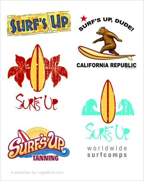
What you see down here are some more results that appear when you start searching in the net about “surfs up logo”. The first one is the logo of the movie itself. The rest logos are done by Tom Cannon , except for the logo with the bear :)

