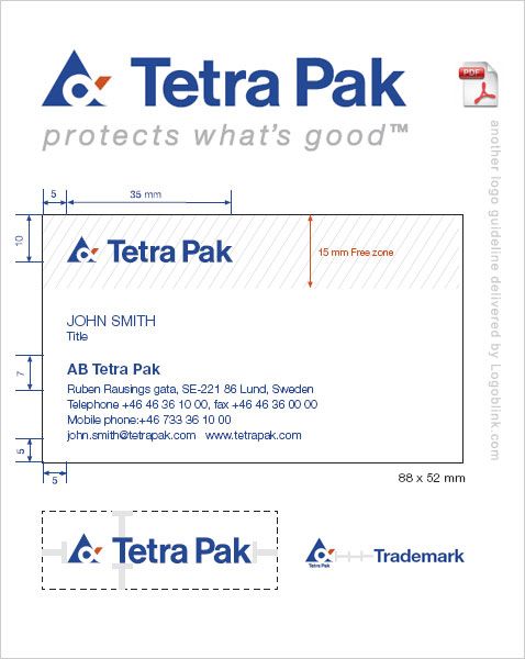
What I like in this logo guideline of Tetrapak company is the manner things are presented. Take for example the free zone distance – it’s not presented by “x” or some lacking individuality symbol, but with the “T” from the word mark.
The contents consist of:
5 One logotype – three fixed combinations
8 Colours
10 Typography
12 Trademarks
14 Correspondence
Communication structure
21 Our message levels
22 Tone of voice
Printed matter and advertisements
24 Printed matter
25 Consistently Tetra Pak
25 The Tetra Pak brochure layout principle
28 Corporate information, layout examples
30 System information, layout examples
32 Product information, layout examples
34 Advertisements
34 Additional campaign material
Other applications
37 Presentation material
40 Signs on buildings
42 Supporting signs
44 Product and package signs
48 Exhibitions
50 Vehicles and transport
52 Clothing and gifts
so, please, download this fine 56 paged pdf graphic guideline [ 2.08 MB ]
