I’ve just grabbed my camera and shot all the logos I could easily find in the kitchen. They are not listed in a specific order and most of them do not represent local brands, but still – they are all kitchen logos we can learn something from. May be ;)
1 – We have to admit – it’s an interesting mark. Also the label is clean and classy.
And the second version of the logo on the top of the bottle is making things even more interesting!
2 – Nothing special, but good overal combination. Credits go to the package designer. Whoever he is.

3 – Cheap web logo for cheap fridge. By the way – the fridge is actually working well.
4 – They’ll redesign this electronics logo soon or later. With a little touch it could become much better.
5 – This is may be the cheapest logo of the collection. Or I should say logos. What saves this label is that the orange is fitting very good the curve of the K. The juice itself is not bad.
6 – I like this logotype. The double Q stroke that accompanies the ll at the end. Clever solution.
7 – First reaction – nothing special. Second reaction – very good logo. You’ll tell me why.
8 – I like the little anchor.
9 I love this mark and the package.
As you can see – the logo works well on another product
10 – I’ve drunk too much of these, so I’m prejudiced.. :) But it’s a nice logo / label, right ?
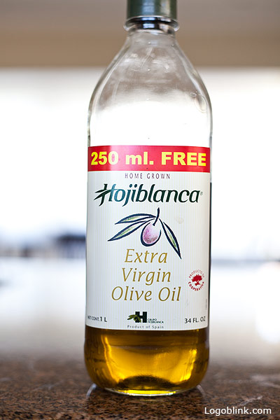
11 – Teel oil = sesame oil. I smell redesign.
12 – I like the top logo version more.
13 – I’m still wondering about the mystery flipped F, used as a L. I’ll never notice this if it wasn’t this shot…
14 – More of an illustration, but it’s nice that they’ve took a specific part ( the eyelash ) and used it at the top as a logo.
15 – Addictive drink. May be it has to do something with the logo… ?! The thing is that they have large variety of “tisers”. Like Grapetiser … and they are not changing the mark. They just change the color of it and the logotype, of course… It’s a pity I can’t show you more examples. May be in another post. Also the label is very cost effective and very attractive. May be it’s not very visible from here, but the fruit mark is some glossy cool pantone that just please the eye.
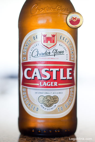
#16 – A beer like a beer. Average logo
17 – Yes, another “Starbucks” logo.
I’ve seen this for a first time – the same circle logo is actually widen here and it’s reworked as an ellipse. Nice adaptation. I wonder if this counts as a “dynamic logo”.. ?
18 – As far as I’ve seen – it’s a brand with history, but this particular design is a copycat of some greek salt packaging designs I’ve seen 20 years ago. Seriously.
#19 – Here comes my favorite logotype from this collection. I really want to congratulate the designer. I wish I’ve designed this logo. Hope it’s not another copycat. Further research should be done…
Also looks great in negative. As every cool logo should.
20. Cheap. My wife must bought it :P
21 – Nice label, but not a special logo.
22 – Once again I love the overal label design.
23 – Same as 22 – the combination looks nice. Did you notice that the fruits and the other objects are non-symmetrical and are not the same, but the composition is great. Nice concept.
24 – There’s something weird in this logotype… or may be I just have a vision…
25 – Famous brand, famous logo… I think they were betting more on the sun mark in the past ( not very well photographed here above the label ) . They could simplify it and put it back in the game, not ignore it like this…
26 – If you look carefully the curve of the logotype is some how broken. And this is a subconscious message to all the users of this product out there. Overal – good label.
27 – I haven’t payed attention that the letters are moved up and down till I made the shot. It’s nice. Do you think that it would be nice to replace the ‘ at the end with the clover some how.. ?
28 – Great deliworld, indeed. Nice logotype although I’ve seen the same G in the Grapetiser logo so may be it’s just some font they’ve used…
29 – It was in the kitchen and I shot it. There’s something in the Nature’S SOURCE, but may be it could be touched a little more…
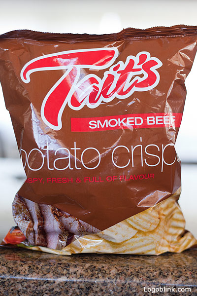
# 30 – Nice logotype – average chips. I was misled in this case by the good package design of the colleagues.
# 31 – Nothing special, but it works.


