A lot of praise could be said for the talented graphic designers from all over the world and their work. This post will open a word about the ones who made their way from Japan. The Japanese graphic designers’ work embodies rich culture, traditions, colors, shapes and concepts, which are a way far from the western world’s tendencies. After the war the country of the “rising sun” turned out with a big potential in the field of culture and industry. Even without the historical knowledge one could easily remark how creative, abstract and unique the Japanese art is, especially when it comes to the logotypes of the country’s municipalities. Their design fully possesses the nerve to be labeled as unique and avant-gardish, because it successfully distinct from the trivial ideas of trees, fountains and sun shines, which are so popular in the Western world.
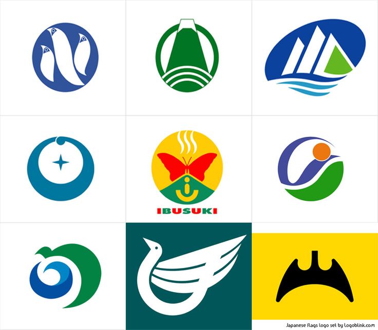
Every Japanese municipal has its own symbol with different meaning. A quick eye over the logos of random cities will leave the impression that every place has tried to beat the other with the most original concept, catching the city’s identity. Though each place’s logo is strongly unique, there is a common element that the most observant ones will notice– most of the designs stick to the simple style of the Japanese flag.
Fuji, Shizuoka
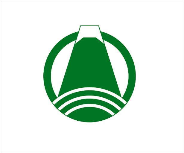
What a beautiful green image, right? I truly hope you do not take it as a reference to the Emerald city, because it’s not. Neither it’s about Oz, nor Kansas at all. Actually it’s about the beautiful mountain Fuji. And there is a nice city named Fuji as well, most of which holds a pretty good view to the gorgeous mountain. The logo represents the mountain and refer to 1966 when three municipalities merged to form the current city.
Hamada, Shimane

Hamada is a city on the Sea of Japan and posses beautiful white sand beaches. Respectively the logo represents sea waves and a beach, as there is a kanji symbol in the middle. The style resemblance the flag of Japan and embodies the unique nature of the city’s location.
Ibusuki, Kagoshima

The current city Ibusuku was merged from three towns in 2006. And this is what the three white lines in the logo above stand for. The stylized letters ‘I’ and ‘U’ are reference to all of the vowells in the city’s name. The butterfly is one of Ibusuku’s symbols, which explains the reddish prettiness in the middle.
Imabari, Ehime
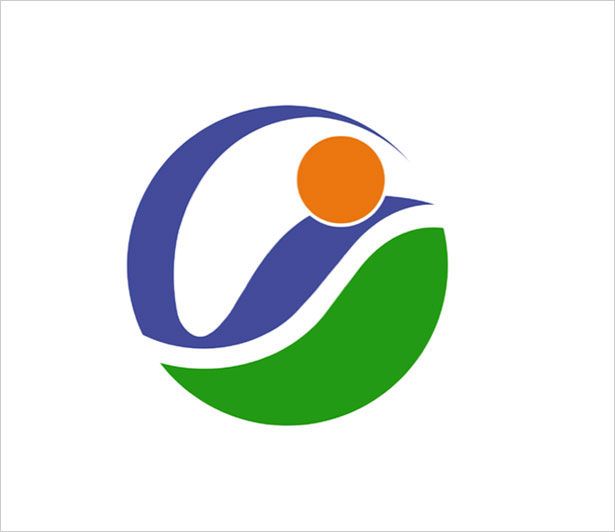
Imabari’s logo shows three elements, none of which, regardless the shape, is Pepsi. Land, water and a bridge – they represent the Inland Sea, the bridge over Kurushima Strait and the green coast. Features that could not be seen in a lot of places gathered together in such a unique way. Whether the stylized ‘I’ symbolizes the Inland Sea or the city’s name is unknown, but let’s suppose it refer to both.
Itami, Hyogo
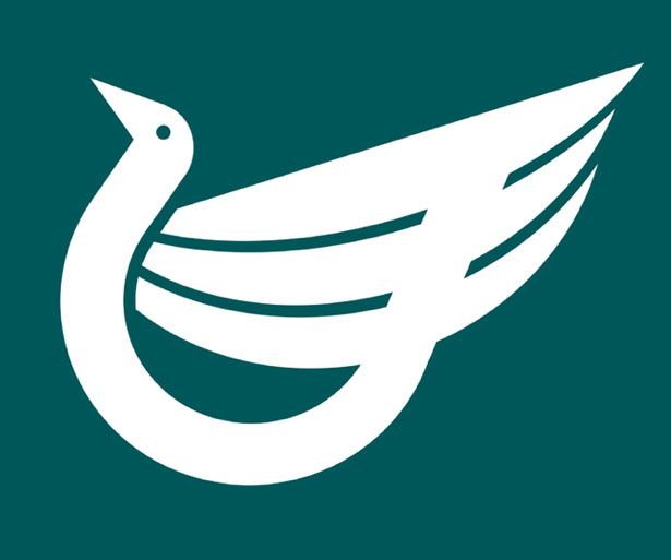
The Koya Pond, one of the most popular stopovers for migratory birds, is located in Itami city, Hyogo. The meaning of the logo embraces the uniqueness of the Pond as the concept shows blue background and stylized kanji as a water bird. Simple and great. “Less is more” in its full potential.
The Japanese Gotham city ;)
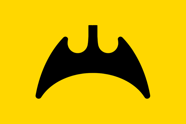
The symbol of Fukuyama city represents a mountain shaped as bat. Considering the black and yellow colors the comic fans probably will be disappointed to learn that the bat does not stand for Batman’s cave. It has more to do with the Fukuyama Castle, which is set on a location known as The Bat Mountain.
Hakusan, Ishikawa

Sea, river and a mountain – three in one for the city of Hakusan’s logo. Their particular meaning is connected to the Teodori River, the Sea of Japan and the Mount Hakusan. Simple and sticky.
Noshiro, Akita
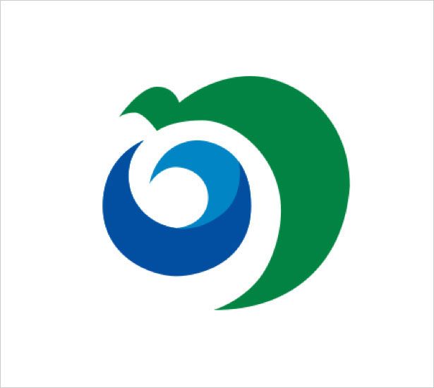
The city of Noshiro is located in the Akita Prefecture and is bordered by the Sea of Japan to the west. The specific location of the place is visualized in the city‘s logo – the blue element represents the Sea of Japan and the green part is the Shirakami Mountains. Quite minimalistic, but very descriptive – a praise that every logo dreams for.
Ogasawara, Tokyo
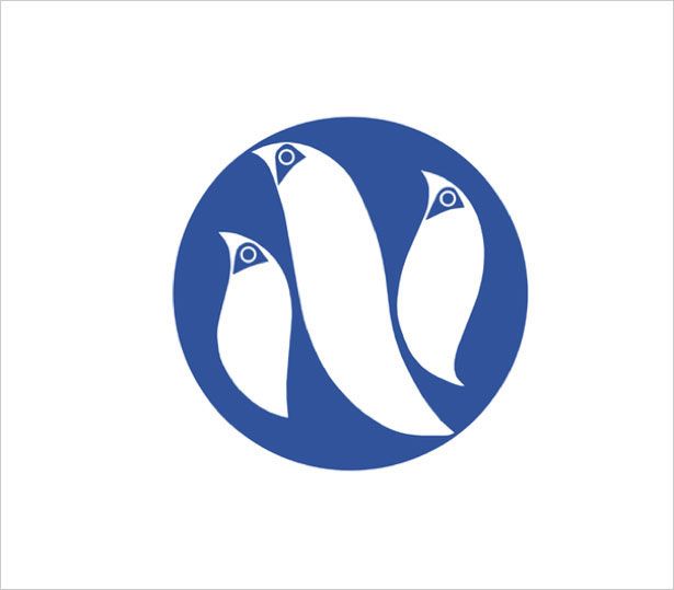
Ogasawara is a village that governs the Bonin Islands, Volcano Islands and three remote islands. The logo shows a disk and three birds within. The birds stand for peace and unification of the islanders. The logo does a good reference to harmony and progress and does it in a truly unique way.
This humble selection of signs on the flags of the Japanese municipals is a good index to where this country stands on the world map of art and design. Nevertheless more academics are starting to talk about the Japanese influence on the western world’s graphic design, which is quite controversial to the majority of westernization theories not just in the graphic design, but in all academic fields as well. So the next time we open a word about Japan, we’ll do a praise to some big names from this field as well. Stay tuned to learn more about the richness of this culture.