American Airlines is one of the most popular airlines in the world. They have been around for about 80 years now and have changed their logo design a few times. You can see the evolution of the AA logos, compiled by designboom.com, here:
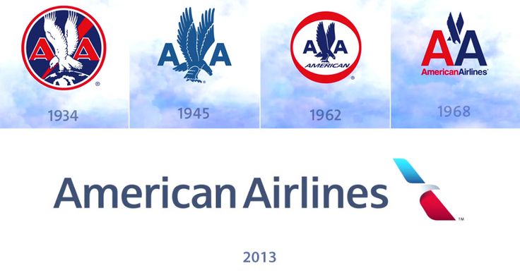
The last one is the American’s new logo design, changed on 17th January 2013. Except for this time they didn’t only change the logo but rebranded everything. In the slideshows below you can roughly see how the changes were made, but if you are more interested in this topic, check out the YouTube video, posted on this page.
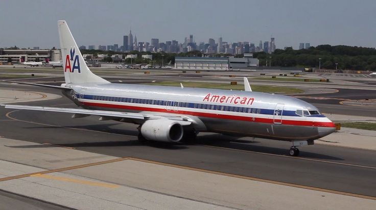
The old branding of the AA airplanes with the previous logo on the tail.
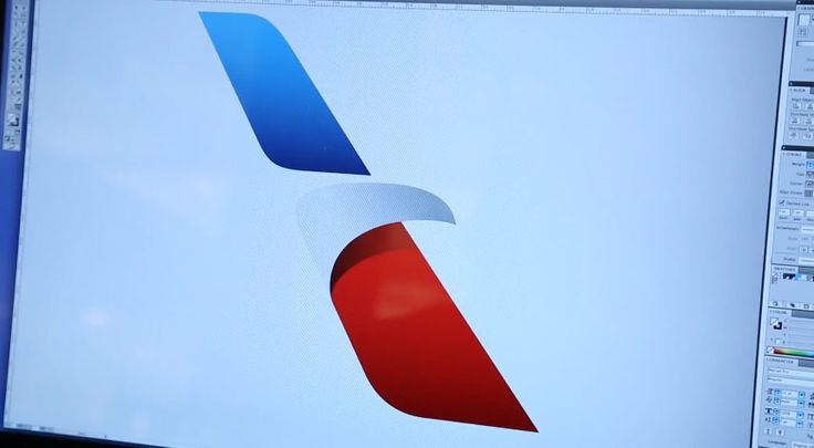
The design of the new logo. As mentioned in the video, it is called “the flight symbol” by its designers. It represents the eagle in a modern way, a very Americal symbol, and part of the previous logo designs. Furthermore, the eagle’s wings are shaped like airplane ones, and the color palette – red, white, and blue – is again present in the design.
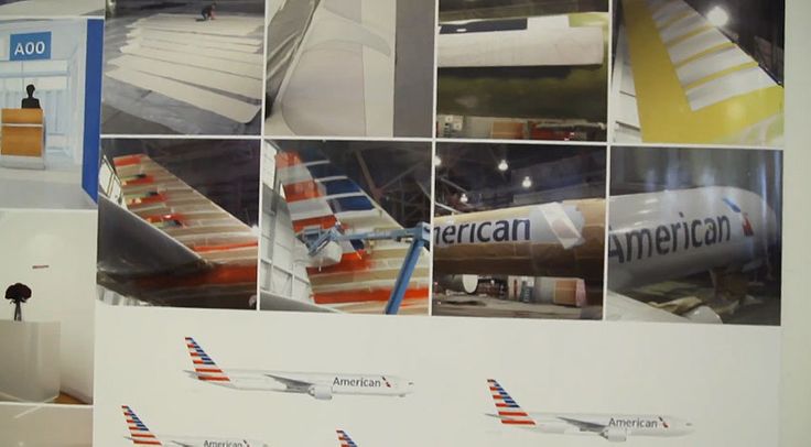
The process of rebranding the exterior of the airplanes.
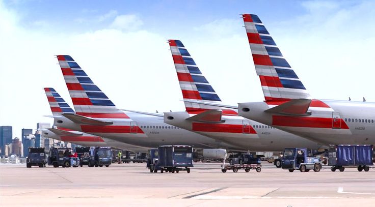
A few airplanes with the brand new design of American Airlines.
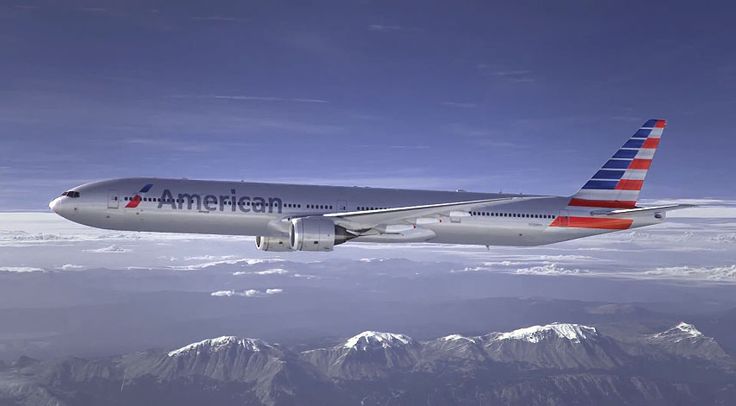
A full grasp of the American Airlines 2013 branding.
You can read an interview with Massimo Vignelli – the head of the design team which created the previous logo. This was a successful logo design which lasted for over 40 years. Successful enough that discussions between the public arise whether a rebranding of American Airlines was necessary at all. What do you think? Which logo and brand design would be more beneficial for the airline company?