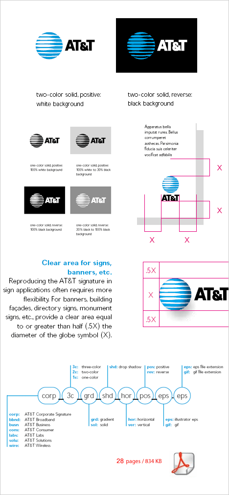
A clean and ordered logo guidelines about the previous AT&T mark. Old, but gold ! I like the way things are presented – pages are not empty, but not too crowded with schemes – you can easily absorb the information. Also simple explanations are given, so that a non-designer should work in a correct manner with the logo. Just click on the picture to open the PDF in a new window.
Recent posts
Popular Posts
Canadian logo set / 53 Canadian logos
21 views per dayThe Hidden Meaning In The Logos of Hyundai, Toyota and BMW
21 views per day8 Famous Rock Music Logos Explained
11 views per dayWorld of Logotypes book – 70’s book scans – 120 pages
10 views per dayTop Symbols and Trademarks of the World – [ PDF ] 2 books
9 views per dayA-style logo hidden meaning
9 views per dayEquus logo design – Hyundai Premium Brand
7 views per dayFord Guidelines Brand Book [pdf]
7 views per day44 RECYCLE logos and symbols
6 views per dayBurton Snowboards Logo
5 views per day
