Bing is the search engine of Microsoft that was launched in the middle of 2009.
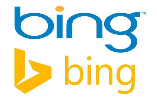
In September 2013 Microsoft presented their new Bing logo. The introductory video on this occasion marked the rivalry with the search engine of google and tried to position it like “something more than just a box with search results”. The video indicates a huge amount of bing’s qualities compatible with tablets and smartphones, and other Microsoft products as well. With the complete redesign and the new features it became clear that Bing takes on directly with Google.
“The new Bing identity is more than a new logo and color palette – it’s a system of brand architecture that allows us to strategically and visually evolve Bing in line with our mission and our products. We didn’t set out to just provide data via blue links on the web. We set out to provide clarity, decisions and insights. Bing is no longer just a search engine on a web page. It’s a brand that combines search technology across products you use every day to help empower you with insights. It’s time we all stepped out of the confines of the search box to stop searching and start finding.” – Scott Erickson, Senior Director, Brand and Creative
Compared to other Microsoft products‘ logos Bing differs because is not starting with a capital letter, which is kind of strange, but has it’s own explanation, which you’ll find in the next paragraph. On the other hand the ‘b’ is stylized as a symbol, which gives identity to the product and is not necessary to use the whole word in order to refer to it. The new logo follows the Microsoft’s minimalism tendency and features a golden/yellow color, which is away from the blue we’ve known from the old logo. The typeface was also changed as it is in Segoe font now, following the other Microsoft products’ line.
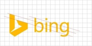
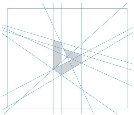
“The wordmark is a customized version of our corporate font Segoe. We retained the lowercase ‘b’ in tribute to our Bing logo heritage and to provide a slightly less obtrusive stance. The descender on the ‘g’ has been slightly modified to curve upward in a friendlier manner and the cut on the top of the ‘b’ mirrors the angle on the cut of the ‘t’ in our Microsoft logo. The kerning pairs of the ‘i’ and the ‘n’ are exactly the same as the ‘i’ and the ‘n’ in the Windows wordmark. The symbol, a stylized ‘b’, evokes a sense of movement, direction and energy. The color loosely pays tribute to the orange dot from the previous Bing logo while also fully embracing the Microsoft color palette and taking inspiration from one quadrant of the corporate flag logo. “
Considering the old Bing logo, we could say for sure that the new is the better one. Giving the circumstances that the search engine suffers changes not only on esthetic, but on functional level as well, we could say that Microsoft made a right choice to stick to the simplicity.
Which logo do you like more: the old one or the new one?


