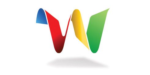
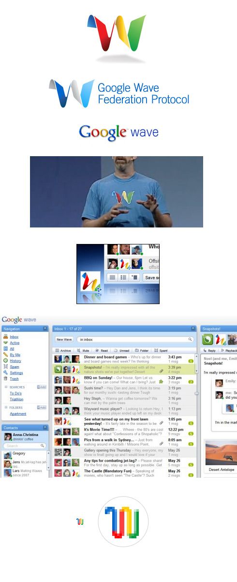
Google “wave” is a new “collaboration tool” that you and me are probably going to use soon. This post is about the logo design of this new product. I’ll try to cover the basics – what kind of logo it is, why it’s designed this way, what are the similarities and the differences compared to other logos. Also, you’ll find a small collection of graphic situations and interpretations of this new logo. Or just click on the picture to download the logo in vector format.
The logo actually looks nice at first glance. It represents a cool 3D logo with gradients and a shadow bellow. It looks as the main shape is floating freely in the air. It’s supposed to give a feeling of a new technology, something extraordinary. It could be easily mistaken for a new game console logo, but the colors give it away.
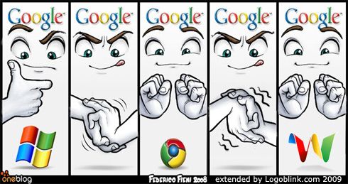
There’s no logotype – they’re **only **using a mark. As it is with “Chrome”. The color pattern is also the same – 4 colors – blue, red, yellow and green. Visit oneBlog for more comics.
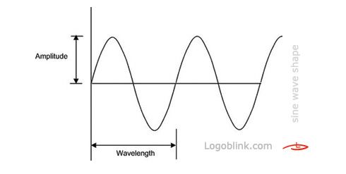
One should admit “wave” is a nice naming. Many associations are available, but what kind of wave is the logo? I think it’s a “sine wave”. The sine wave or sinusoid is a function. It **often **occurs in mathematics, music, physics, signal processing, audition, electrical engineering, as well as in many other fields. Again, like “google”, we have a mathematical meaning. More info on this topic you can find in wiki.
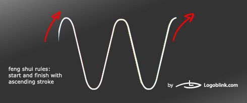
Maybe they’ve designed it on purpose, maybe not, but there’s a curious fact about the line of the logo. If you are interested in feng shui signature rules you can read the following paragraph:
“For success and prosperity, it is best to start with an ascending stroke with the letters rising upwards as you sign and also end with an upward stroke. This signifies a good beginning and a good ending to every project undertaken in future. Signatures ending in downward strokes do not ensure happy endings. Straight-line signatures usually go unnoticed. They are considered neither auspicious nor inauspicious. This can be strengthened by adding a firm line underneath that goes upwards.”
The product is not available for the masses yet, but there are a few different usages of the logo here and there. All the following logo variations of the WAVE are officially used by google at this point. I think the avatar with the tilted logo is a good idea. However, the main disadvantage of the mark is that it doesn’t look good in small scale, so the problem should be solved in a way. Google Wave’s logo is also loosing points when presented in a background, different from the black and white. As you can see on the picture with the t-shirt (a screenshot from the WAVE presentation) – the usage of all basic colors doesn’t leave many options for the background. Blue is a logical decision for a backup, because it takes just a small part of the logo. Nevertheless, a perfectionist would always go for white.
Another thing – I like the favicon very much. Hope they won’t change it soon for a reason.
It’s always good to be aware of the other logos in the brand family. I’ve tried to pick enough examples so that you can compare for yourself. A simple conclusion is that the new mark is a sign of a new hope. Services like AdSense and AdWords do NOT have their own mark or logotype – they are just a part of the family. But Google Wave is born to be different. The usage of just a mark is even a bit haughty in a way. As if we have to know that it is “Google Wave”. After all, it took NIKE a lot of years to remove the logotype from the swoosh. Look at “Bing” – another web star that was born last few weeks – a simple logotype, not pretentious in any way. But Google is big and famous enough to afford it. I guess we can conclude that Google Wave logo is designed in a nice way and it’s actually one of the best Google logos, that we know of.
Yes, the “wave” symbol is often met in other logo designs, especially in brands concerning water sports (O’Neill & Billabong). The Coca Cola Company also uses it. Although it’s not a part of the official logo, Coca Cola always have used the wave in their identity. It’s just working for them. The wave is a symbol of joy, change, movement (etc.) and it looks nice. In my opinion Sony’s VAIO logotype (or mark ? :) ) is the best example of a modern technical logos. Abstract enough, and yet readable for the targeted consumers. I like VAIO for another reason – with its monochrome variations it’s a classic logo. No gradients, no shadows and no trendy fashions.
The idea of this mini collection based on wave logo design is to observe how the “wave” idea is exploited in different shapes, colors and manners. A wave could be a “w”, a simple “s”, a combination of 2 and more letters, a curvy shape, a simple tilted line, a swirl, a sinusoid and of course – a stylized illustration of a wave.
As a bonus you can see here this “wave” identity in detail:
What do you think of Google Wave logo design, do you find the information above useful? Comments are always appreciated.
