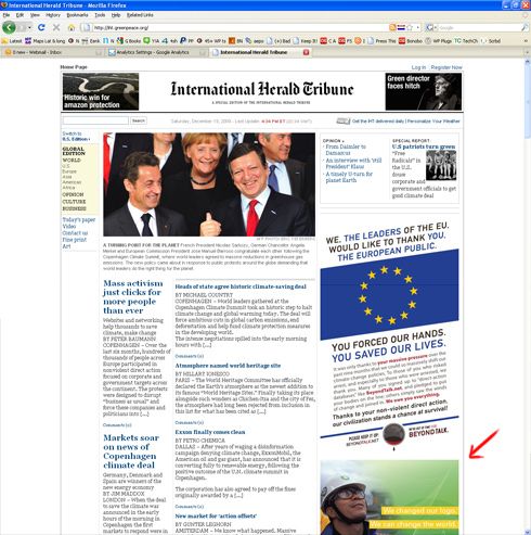
18.06.2009 – BRUSSELS – Greenpeace supporters handed out mock copies of the International Herald Tribune in several countries. On Thursday they sent the mock copies to convince world leaders to agree on ambitious efforts to tackle the climate change problem. The fake newspaper (50 000 free copies) was handed out in Brussels’ European quarters. This happened shortly before EU leaders were to begin a two-day summit at which the environment was of main concern.
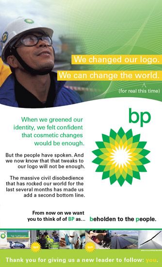
What we are interested in is one of the pages inside. It simulates a BP advertisement, but if you go into details you’ll notice that it actually laughs at the BP logo redesign.
I think Greenpeace have their point.** It’s true that very often design is used to confuse society about the direction** the company is choosing. This can easily be achieved by rebranding and changing the logo of the company. The logo serves as a flag and usually represents one or more corporate values. In this case BP obviously tried to use one of the most powerful symbols – the sunflower – on their behalf . The sunflower is known as a positive and friendly symbol, a sign of the light and the good weather. Combined with the color green, it speaks for a green and positive values. You can check this sunflower logo set in logoblink if you are interested in more logo designs, based on the flower.
The internet version of the newspaper is available at iht.greenpeace.org. Just refresh a few times, cause the ads in the right sidebar are being shown randomly and you may not see the BP logo joke.
.

If you want to read more about this green guerrilla marketing story, click here.
