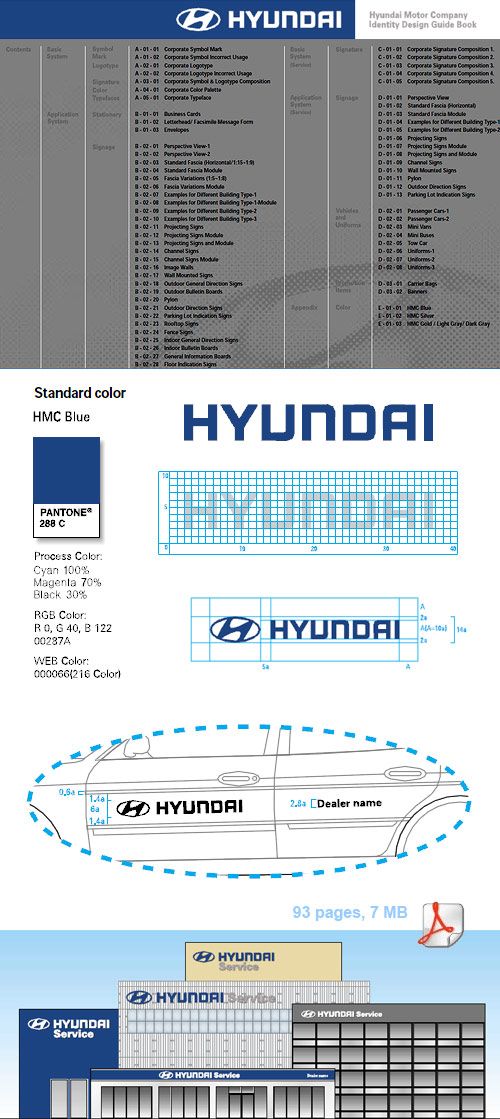
HYUNDAI’s logo is a decent one and so is the logo guideline. Old ( 2002 ) , but interesting, in its 93 pages ( 7 MB ) you can read about:
Symbol
Mark
Logotype
Signature
Color
Typefaces
Stationery
Signage
Vehicles
Promotion Items
Uniforms
It’s interesting the hierarchy between Hyundai and its dealers. Also the various vertical and the horizontal variations of positioning the logotype and the mark. Click here or on the picture to download the PDF file.
