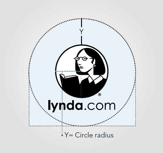
The chance you haven’t watch any lynda.com video tutorial is quite small. Something like 00.5% – especially if you are a professional graphic designer. Lynda.com could be defined in my opinion as a visually stable brand. One and the same logo / logotype for so many years. That’s why I was curious what’s in the logo gidelines…
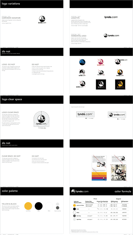
The guidelines are as tide and simple ( in the good way ) as is any classical teacher’s dress. Plain, just the most necessary. I like a lot that they’ve presented the colors in the circle shape – the same as the silhouette of the logo itself. May be you’ll find some useful tricks that you’ll apply for your guidelines. This is a fast preview of the PDF on some of the pages:

