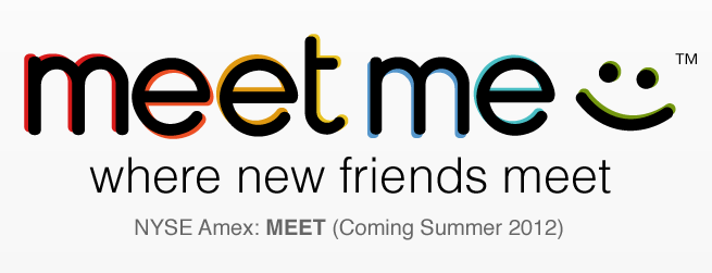
And it’s not so pretty.
A new big player in the social websites market is coming and it brings its own logo.
Meet… “meetme.com” :)
It’s the product of the merger of QuePasa and myYearbook.
Check the stats bellow and you may get an idea what’s that all about.
Whole new 874 million people to meet!
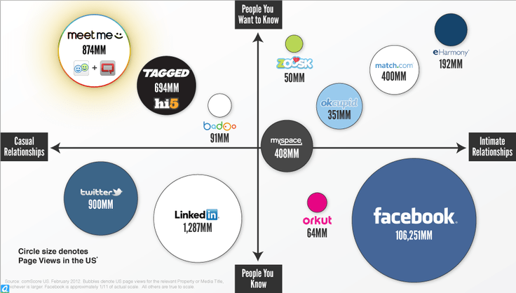
Of course – we can’t check if these figures are correct, but the stats are definitely interesting. Do the logos influence ? Does anything matter all ? Pinterest has the coolest logotype for sure. Facebook the most boring one, but that’s what’s interesting in this case.
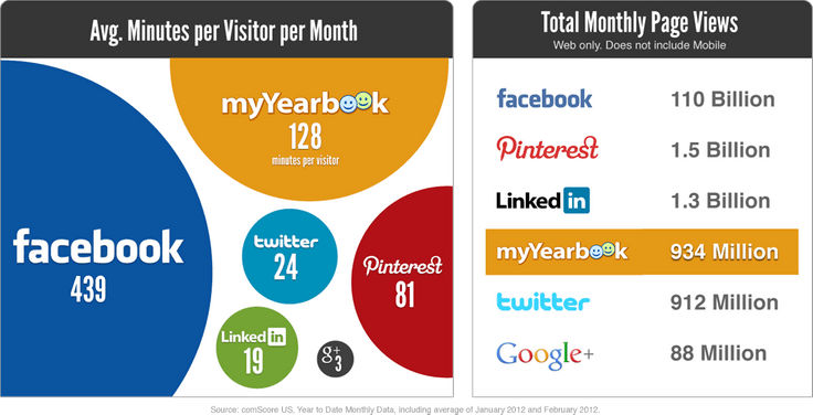
Quepasa has actually a cool logo, but “Meetme“… just doesn’t fit in the charts. I’m almost sure it’s designed in some 99designs competition…
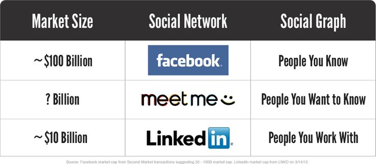
Kind of bottom-line conclusion :
Who cares about the logo when the only thing you are looking for is a f*ck buddy online ? :)