It’s colorful, it’s extravagant.. and it’s not the typical Euro Championship logo, but with the right presentation everything’s fine. Actually the video is made back in 2009, but it’s a really good example of how a brand design should be approached and presented. If the London 2012 Olympics logo had the same presentation – I bet more people would be happy with the design. Anyway – this post is…
The United Arab Emirates is home to many man-made breath-taking views. On the top of my head is the palm-tree shaped hotel complex, located on an artificial archipelago. This magnificent view carries the name Palm Jumeirah. There are many other exciting human creations. The Burj-Al- Arab, a hotel on a man-made island, and Burj Khalifa, which houses the Armani Hotel, are such ones. The UAE is now…
Hope you’ll find some inspiration for you logotypes in this calligraphy video. The pictures bellow are screens from the video itself. Elite is a cultural festival and you can read more about it here.
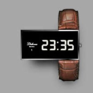
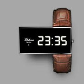
The logotype itself is nothing special, but the positioning is great. This design shows what you can achieve with just a little juxtaposition, with thinking different in a niche where it’s always the same. This watch makes an impression for sure. “Design provides emotion to our life” is the mantra of Spanish designer Oriol Llahona, the man behind Numero 1 watches. With the sentiment being equal…
Daimler, the world’s leading luxury car manufacturer, decided to create a joint venture with BYD, China’s leading economy car manufacturer and this is how Denza appeared. Basically – it will be the local “Mercedes”. That’s why I’ve used this catchy title. The Denza brand is due to consist of a range of electric power vehicles with the first model set to use the underpinnings of the first…
Sun tan logos are great to experiment if your design is simple-shaped … Tan tattoos give wearers a memory of their summer holiday and turn the imperfection of tan lines into a sweet message of love. You can buy these on kiskin.it or just try to make your own sun tan logos / tattoos :)
Any idea what these icons/logos stand for ? They are the Adobe touch logos, launched in 2011, which I somehow overslept :) In case you are wondering ( as I was ) what are these Adobe touch apps for – watch the movie: I’m not sure I’m impressed with the touch logos, but I like the illustration for the recent advertising campaign :)
And it’s not so pretty. A new big player in the social websites market is coming and it brings its own logo. Meet… “meetme.com” :) It’s the product of the merger of QuePasa and myYearbook. Check the stats bellow and you may get an idea what’s that all about. Whole new 874 million people to meet! Of course – we can’t check if these figures are correct, but the stats are definitely interesting. Do…
Here’s what Google says about their initiative : We announced our self-driving car project in 2010 to make driving safer, more enjoyable, and more efficient. Having safely completed over 200,000 miles of computer-led driving, we wanted to share one of our favorite moments. Here’s Steve, who joined us for a special drive on a carefully programmed route to experience being behind the wheel in a…
Here’s what Alex is writing: I am a Graphic Designer who has been developing identities for 10 years. Last year I designed my first piece of furniture called the A Stool. The shape was based on a capital A letter, set in the Replica typeface. The A-frame gives the stool lots of strength and my interest in typography gave the design a fun and different look to most furniture you see. The A Stool…