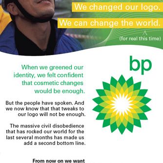
18.06.2009 – BRUSSELS – Greenpeace supporters handed out mock copies of the International Herald Tribune in several countries. On Thursday they sent the mock copies to convince world leaders to agree on ambitious efforts to tackle the climate change problem. The fake newspaper (50 000 free copies) was handed out in Brussels’ European quarters. This happened shortly before EU leaders were to begin…
A-style is a clothing brand. The brand exists since 2003 (or at least the domain a-style.it is registered during that year). However, 2006 could be considered as a real breakthrough. Later a friend of mine sent me an A-style key holder from Italy. If I have to be honest I didn’t get the idea at first sight… but later there was the “LOL” effect. :) Cool idea, designed in a nice way. Everything is…
Google “wave” is a new “collaboration tool” that you and me are probably going to use soon. This post is about the logo design of this new product. I’ll try to cover the basics – what kind of logo it is, why it’s designed this way, what are the similarities and the differences compared to other logos. Also, you’ll find a small collection of graphic situations and interpretations of this new logo…
You gonna see this logo around very soon. It’s the new “Decision Engine” by Microsoft. Another smart search engine. It’s not online yet, but we expect it soon on www.bing.com . The provided EPS file bellow is vectorized by Logoblink.com and it’s NOT the official logo, but it’s 99% identical, so I think it’s OK to use it. Looking for first time at the logo I should say that it’s not irritating…
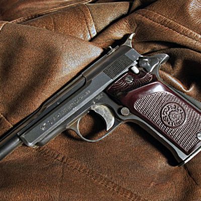
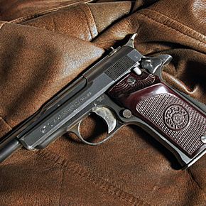
It’s always good to know the proofmarks for different standards :) gun proofmarks 1 – Idnicates admission to ( receipt at ) proof house. Used after 9 July 1931 2 – Proof of test – automatic pistol from Eibar proof house. Used after 1929 3 – Indicates year of proof. Date is 1946 4 – Acceptance bu military inspectors from Spanish service
Hope you’ll appreciate this rare Landor’s interview. It’s uploaded a month ago.. but still it has 4 votes.. so I guess, just a few real logo designers has seen this before you and me :) Enjoy!
Today I was watching a movie on TED and saw this logo. It’s interesting and original in the sea of bulb-related-logos out there. Seems to be a very cool design for a t-shirt or something. I was so charmed by the idea of the logo that I vectorized it for you on the run. Click on the picture above to download the EPS file. I’ve searched for a while to find out who the designer is, but found no clue…