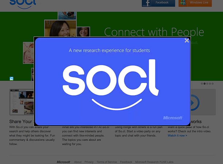
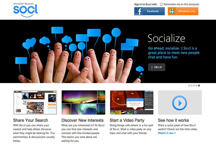
This is how the logo looks in the header of the site.
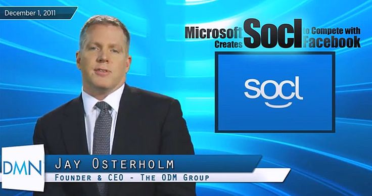
BTW- this is how the announced logo was looking in december, 2011. A bit different. I’m not sure I like the new one more. What do you think ?


This is how the logo looks in the header of the site.

BTW- this is how the announced logo was looking in december, 2011. A bit different. I’m not sure I like the new one more. What do you think ?
